Carry The Load
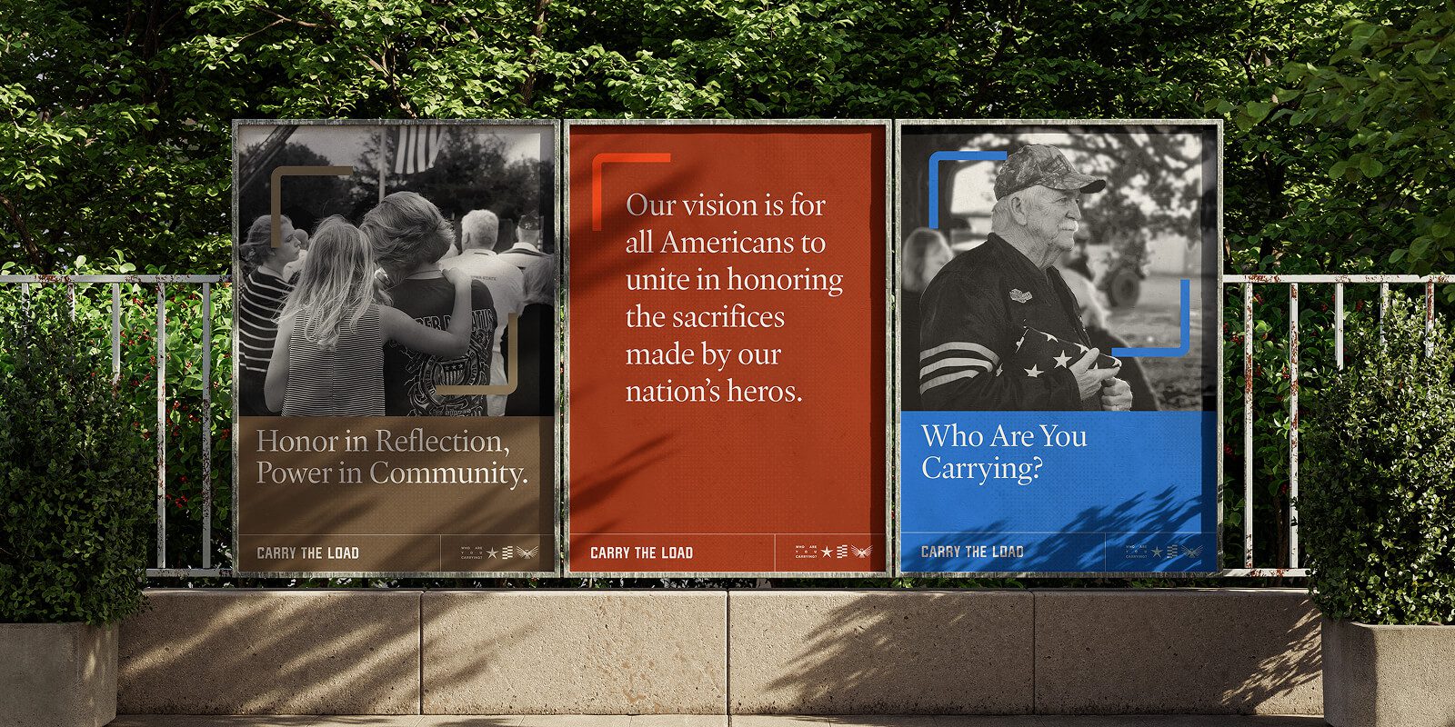
Honor in Reflection, Power in Community
Carry The Load is a national movement to honor and support the sacrifices made by our military, veterans, first responders, and their families. What began as a Memorial Day event has grown into a year-round platform for remembrance, healing, and connection. Because when we honor together, we heal together.
The Ask
Evolving from a moment to a movement.
As Carry The Load expanded its impact, the organization needed a brand that could match its purpose—one that balanced reverence and energy, reflection and action. The challenge: evolve a grassroots identity into a unified national movement without losing the heart and authenticity that define it.
Our Strategy
The new brand positioning, Honor in Reflection, Power in Community, became the foundation for every expression of the organization. It celebrates both the solemn act of remembrance and the collective strength that comes from serving together.
Strategic focus areas:
- Elevate the story – Shine light on individual sacrifices and shared experiences
- Unite the audience – Build a connection between those who serve and those they protect
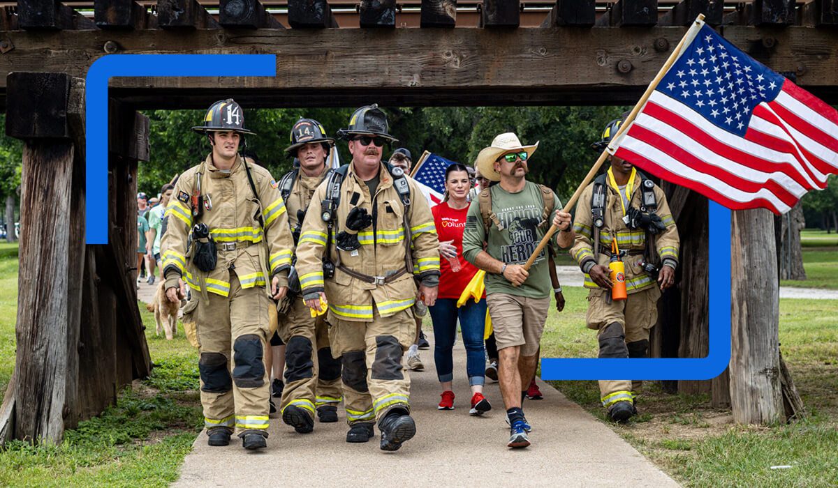
- Inspire participation – Encourage Americans to actively engage in remembrance and support
Identity Design
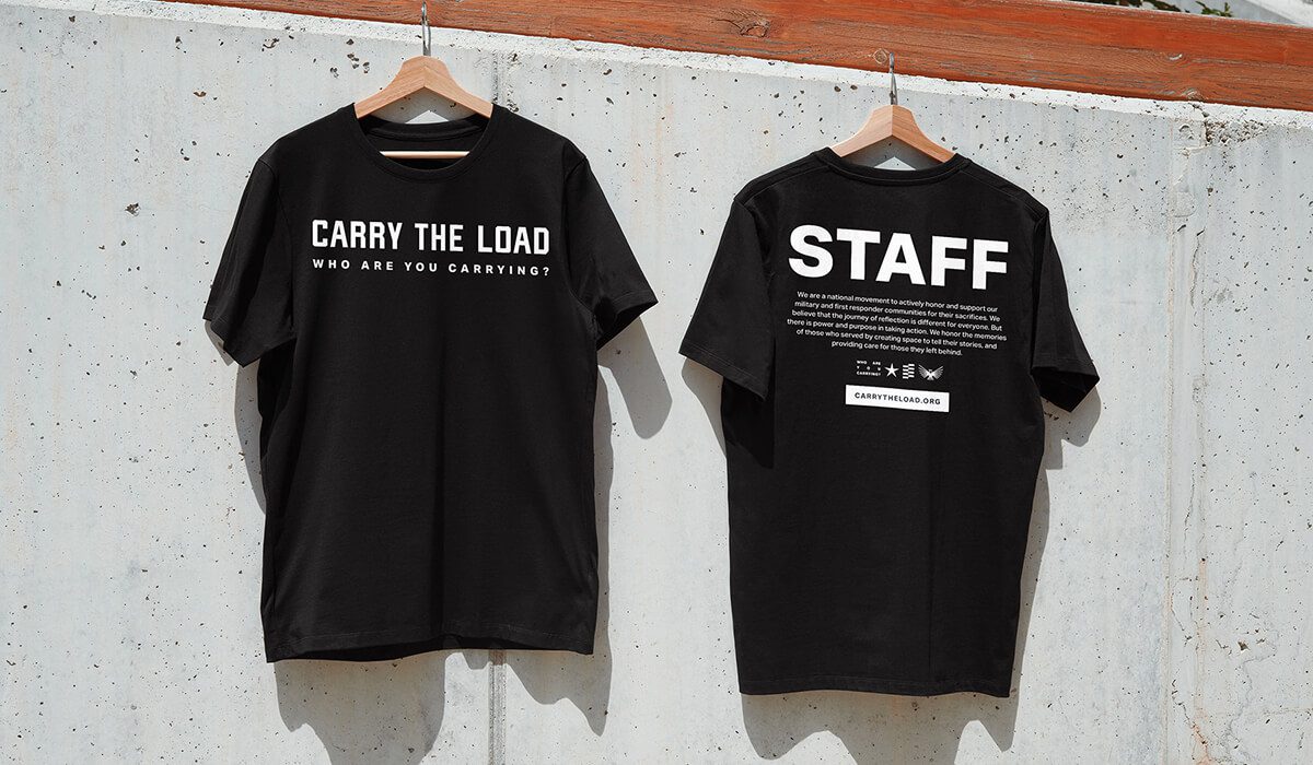
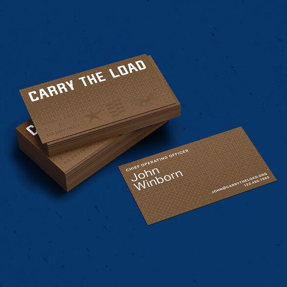
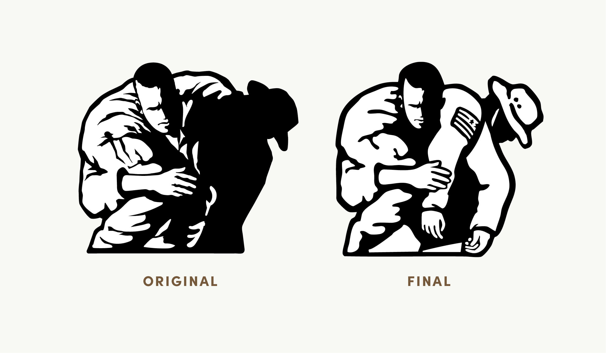
The first phase of the brand’s evolution centered on a comprehensive visual audit. The existing identity relied on a single, restrictive horizontal logotype with no supporting system. The objective was to preserve the brand’s established equity while decoupling the icon from the wordmark to create a more versatile asset. Refining the icon for legibility and introducing a clean, condensed typeface, allowed for greater flexibility across applications while giving the tagline the visual weight it deserves
Refined for Impact
Keeping the brand’s icon equity intact, we refined the mark by removing the dark silhouette, retooling the uniform and adjusting the stature of the man.
A Refreshed Identity Built on Reverence, Resilience, and Unity
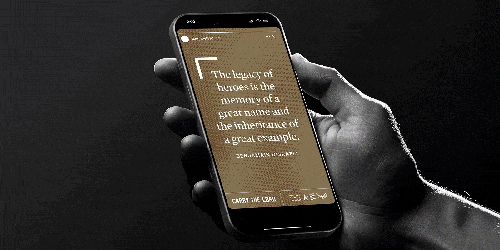
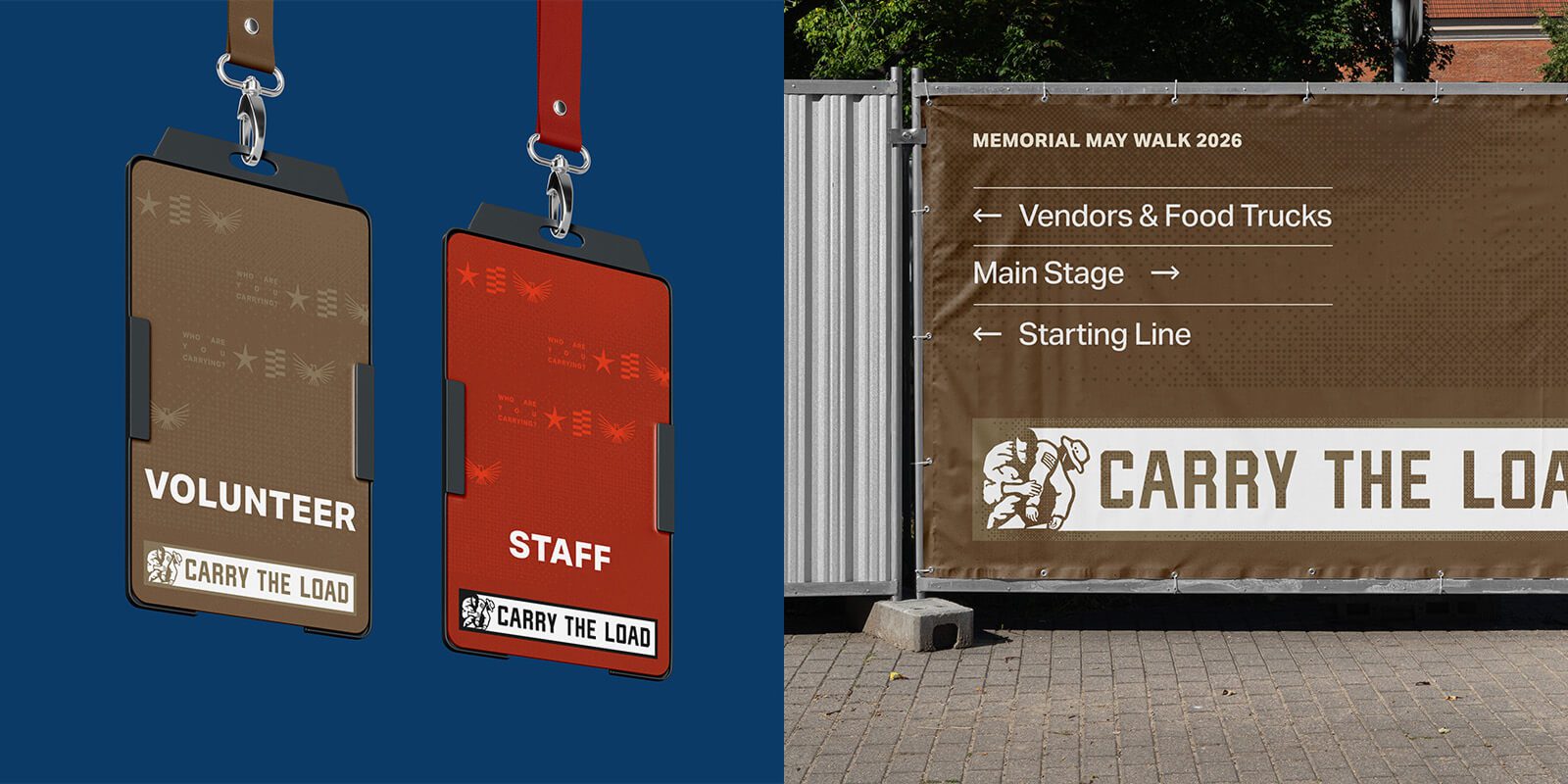
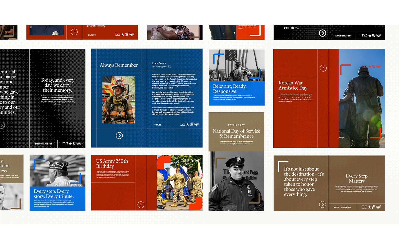
The rebrand translates Carry The Load’s purpose into a cohesive visual and emotional language. The creative direction centers on a modular, layered aesthetic inspired by archival records. Brackets function as a core structural motif—acting as a symbolic container for the stories of first responders and their families. To move away from generic patriotic tropes, the palette was refined using muted red and blue tonalities balanced by a grounded neutral. This system ensures that every touchpoint feels both high-energy and deeply respectful.
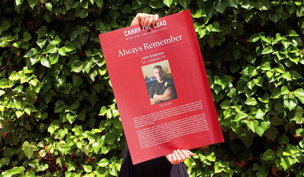
Carrying Honor Forward
Revamping the brand “storyboards” strengthened how each fallen hero’s story is presented and experienced. Designed for use during memorial walks and brand events, the boards are carried by family members—creating a visible system for recognition, connection, and shared remembrance at scale.