The Monday Club
Reinvigorating the Monday Club Brand
The Monday Club of San Luis Obispo was established in 1924 as a woman-run nonprofit civic organization dedicated to supporting local charitable causes for women and children.
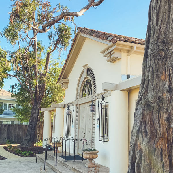
The physical building is also a historical landmark designed by renowned architect Julia Morgan, known for her architectural design of Heart Castle in San Simeon, CA. Over the decades the brand had become stale and membership numbers began to wane. With the unveiling of the recently renovated building the Monday Club knew it was time to refresh their brand and they turned to Matchfire for help.
The Ask
The goal was to reinvigorate the Monday Club brand; pay homage to their rich history, whilst making the brand feel more contemporary and attractive to a younger generation of women.
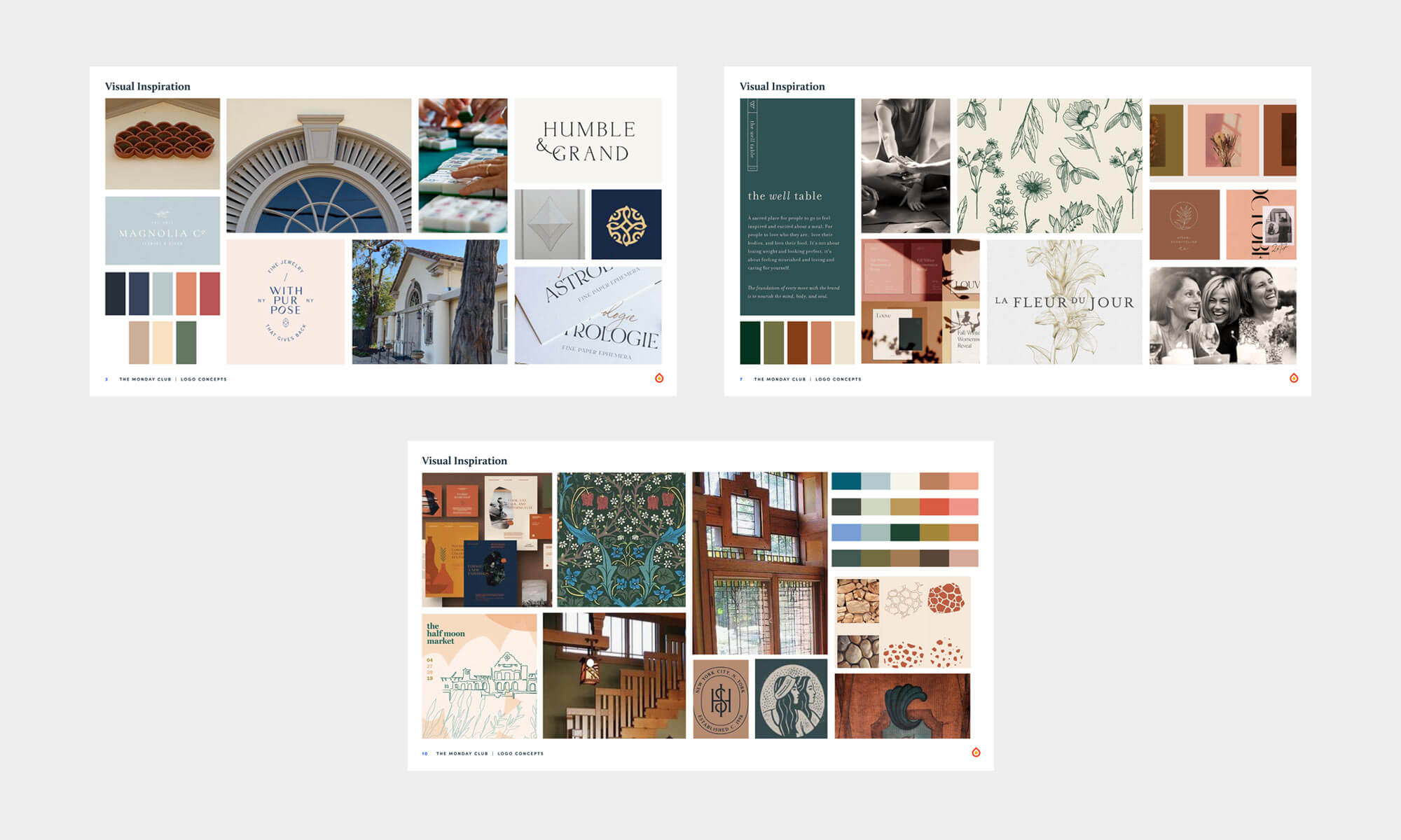
The rebrand launched with a field trip to the historic site. Throughout the building and the grounds, we found all the nuances that Julia Morgan had left behind in her design of the building. From the intricate arched windows, to the wrought iron fixtures, the detailed wallpaper design and heater grates, it was evident these elements would become the baseline for the new brand. We wanted to honor Julia’s design esthetic and embrace the overtly feminine details that embodied the very being of the Monday Club.
Out of this experience three directions were presented to the client:
The Solution
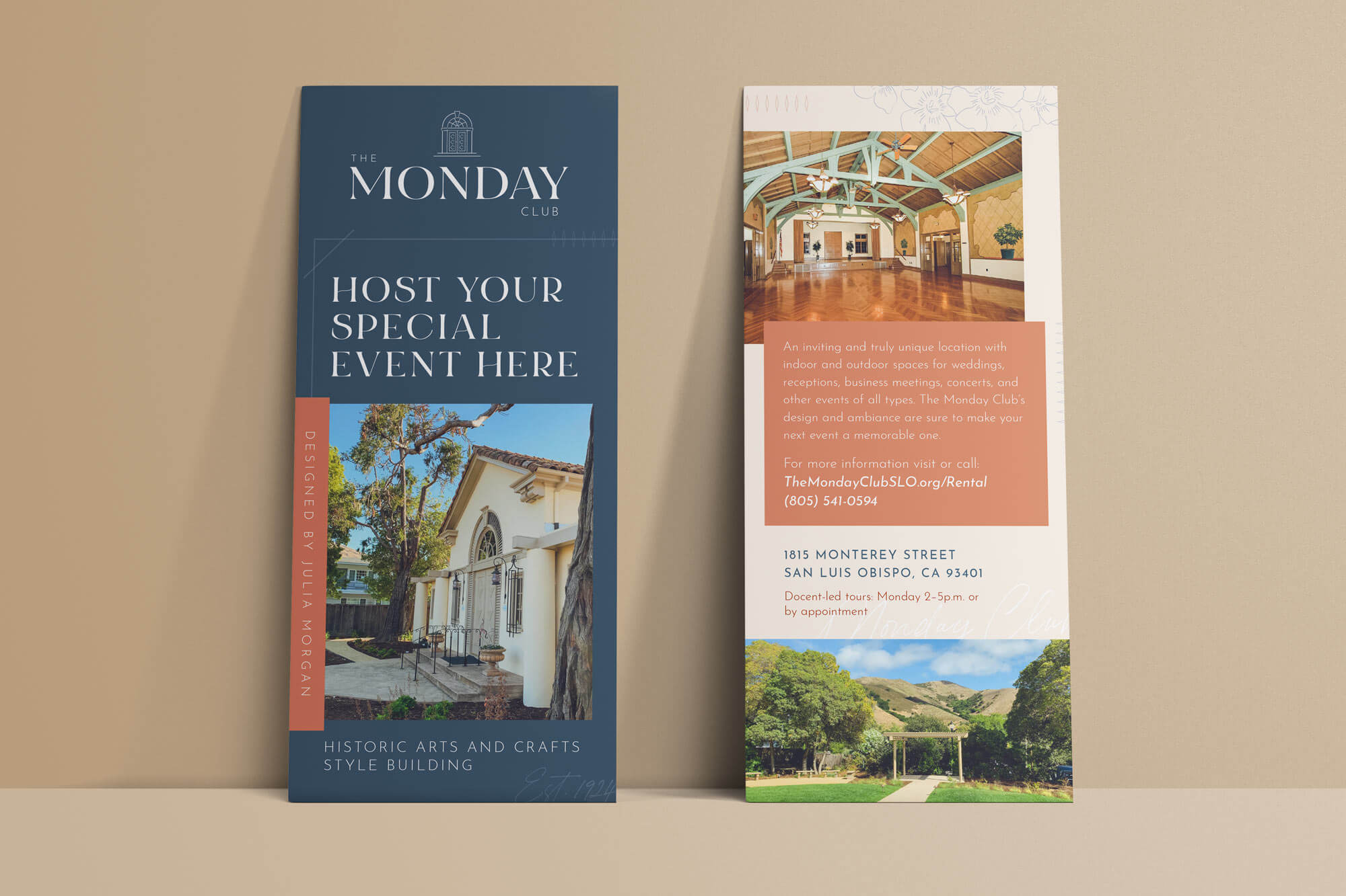
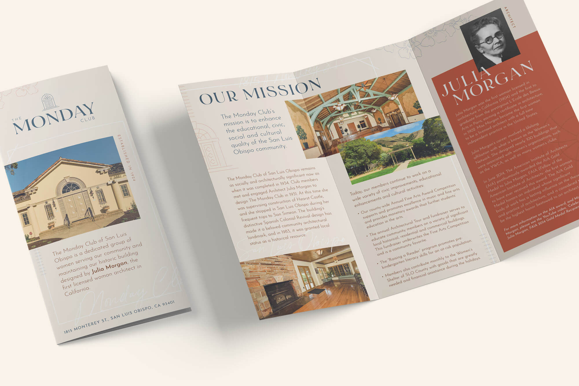
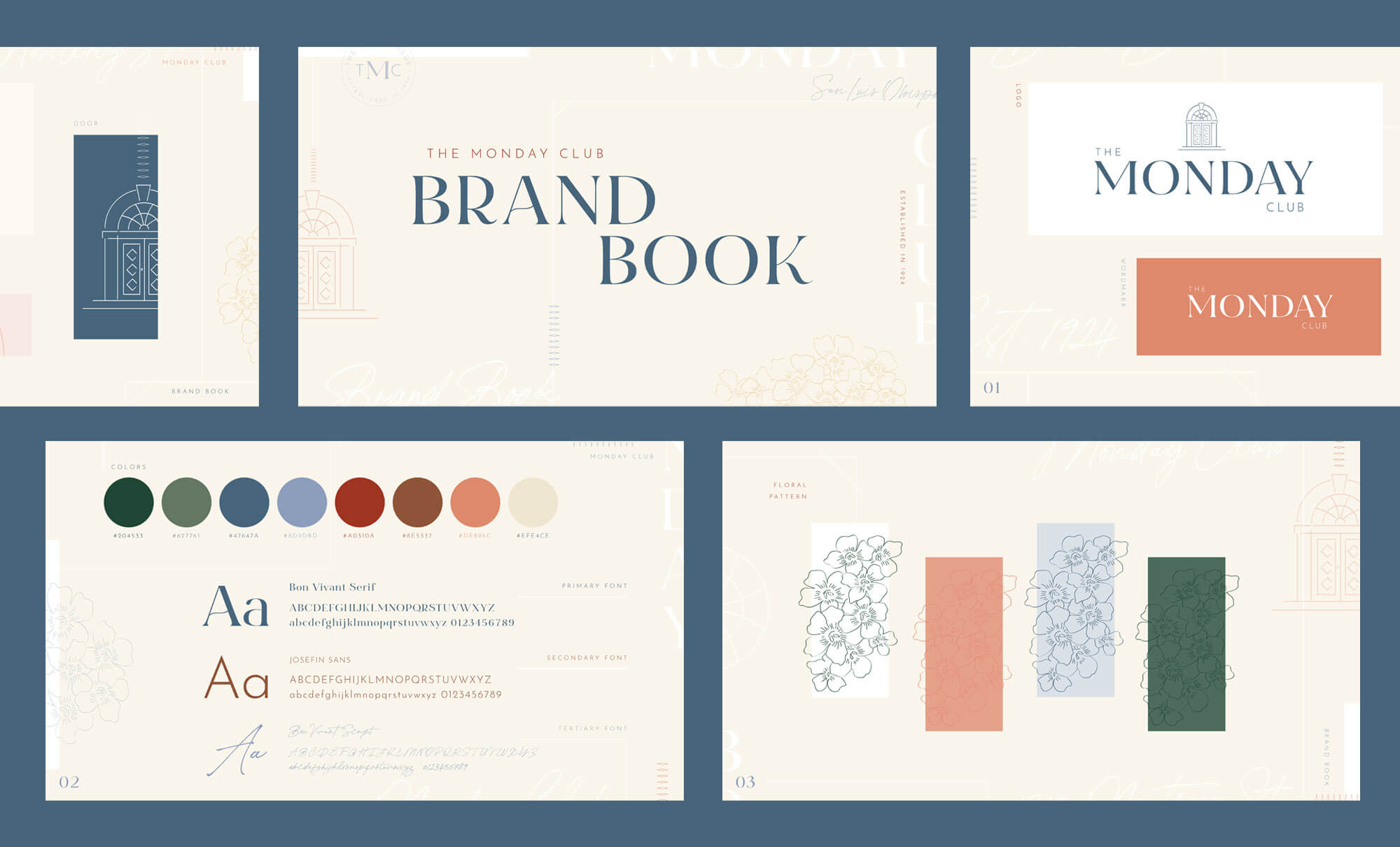
The final brand direction ended up being a combination of ideas with details of the building spread throughout.
- Floral patterns from the vintage wallpaper
- A color palette that matches the backdrop of the San Luis Obispo hillsides and nicely complements the building and grounds
- The front door was sketched an outlined and used a key component to the logo mark and we introduced a sketch of the building to replace the iconic building sketched used in several marketing materials.
- A primary font that plays to the historic and vintage nature of organization, alongside a more contemporary sans-serif font used to modernize the brand. Along with a script font used a tertiary design treatment that represents a human element.
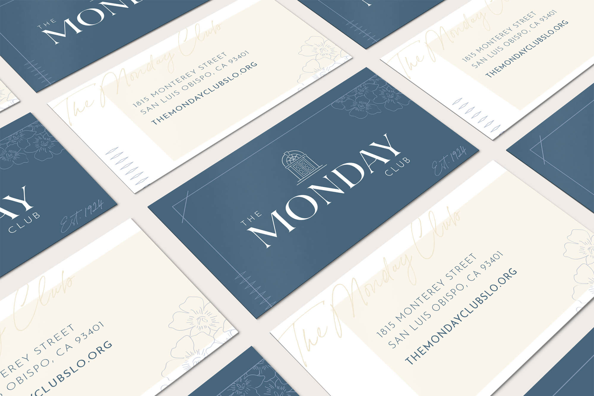
Brand deliverables: Brand Identity System, Brand Playbook, Business Cards & Letterhead, Brand Brochure and a Fundraising flyer template.
The Award
Matchfire is honored to have been awarded for this branding and design work.
- SILVER for Integrated Graphic Design for Social Change 2020 from the 2020 Indigo Awards.
