Teach.org
Inspiring Tomorrow’s Teachers
TEACH is committed to helping individuals who are considering a career in education to navigate the path to certification through personalized career guidance offering resources, experiences, and connections.
The Ask
TEACH.org came to Matchfire looking for a fresh brand identity and website redesign that would inspire candidates and provide customized guidance to anyone considering the teaching profession. The brand legacy needed to stay intact, but pivot slightly into a more modern, approachable brand to better reflect TEACH’s mission, story, and target audience.
The Solution
After a thorough discovery process and in-depth stakeholder interviews, Matchfire created the new TEACH.org brand which included a modernized logo that resonated with their target audience and clearly showcased the nonprofit’s mission and story.
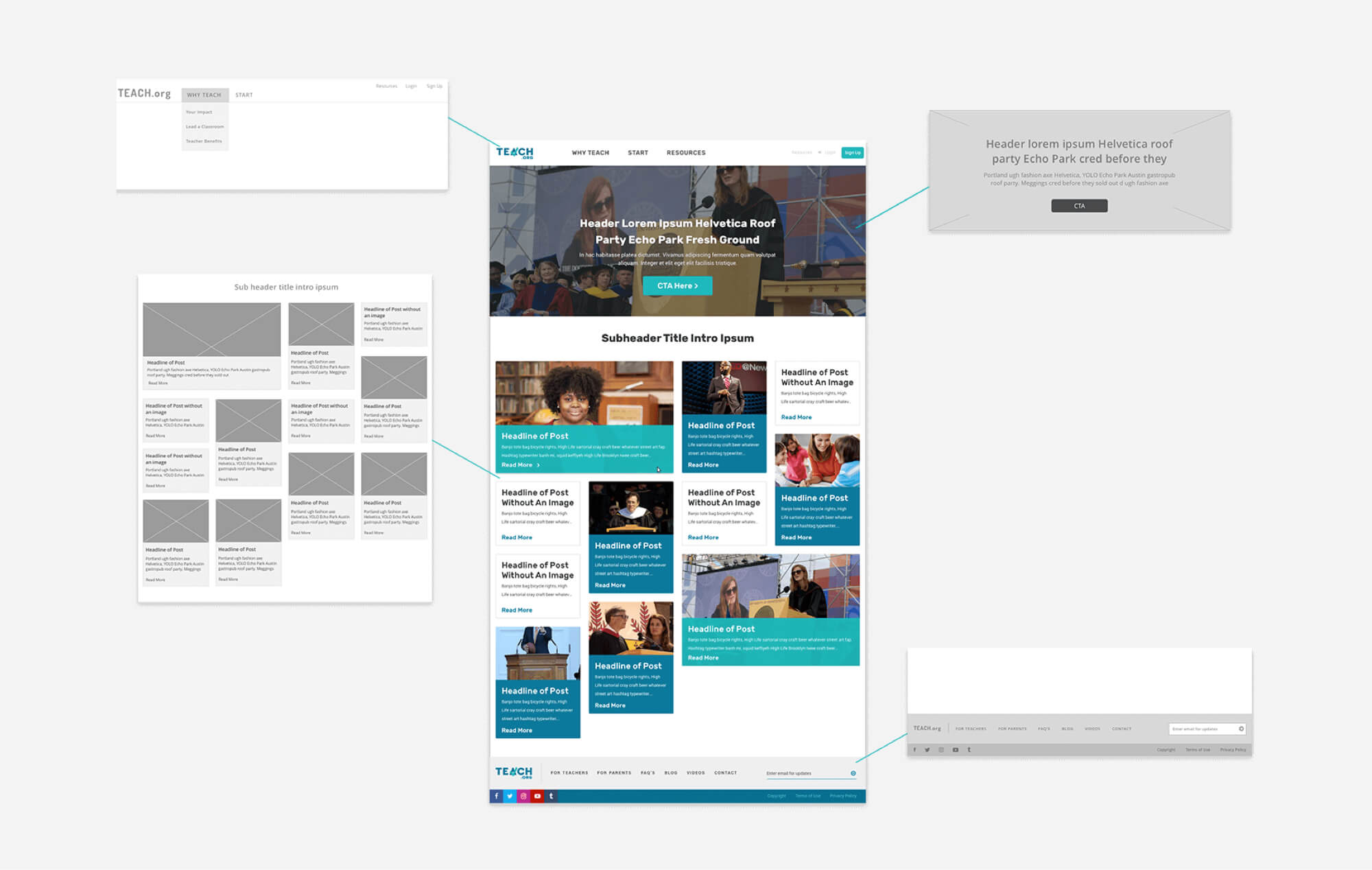
In parallel with the branding exercise, we conducted discovery and information architecture exercises for the website. After conceptualizing the website “wish list,” TEACH.org desired a personalized career roadmap tool to build differentiation into their brand and website.
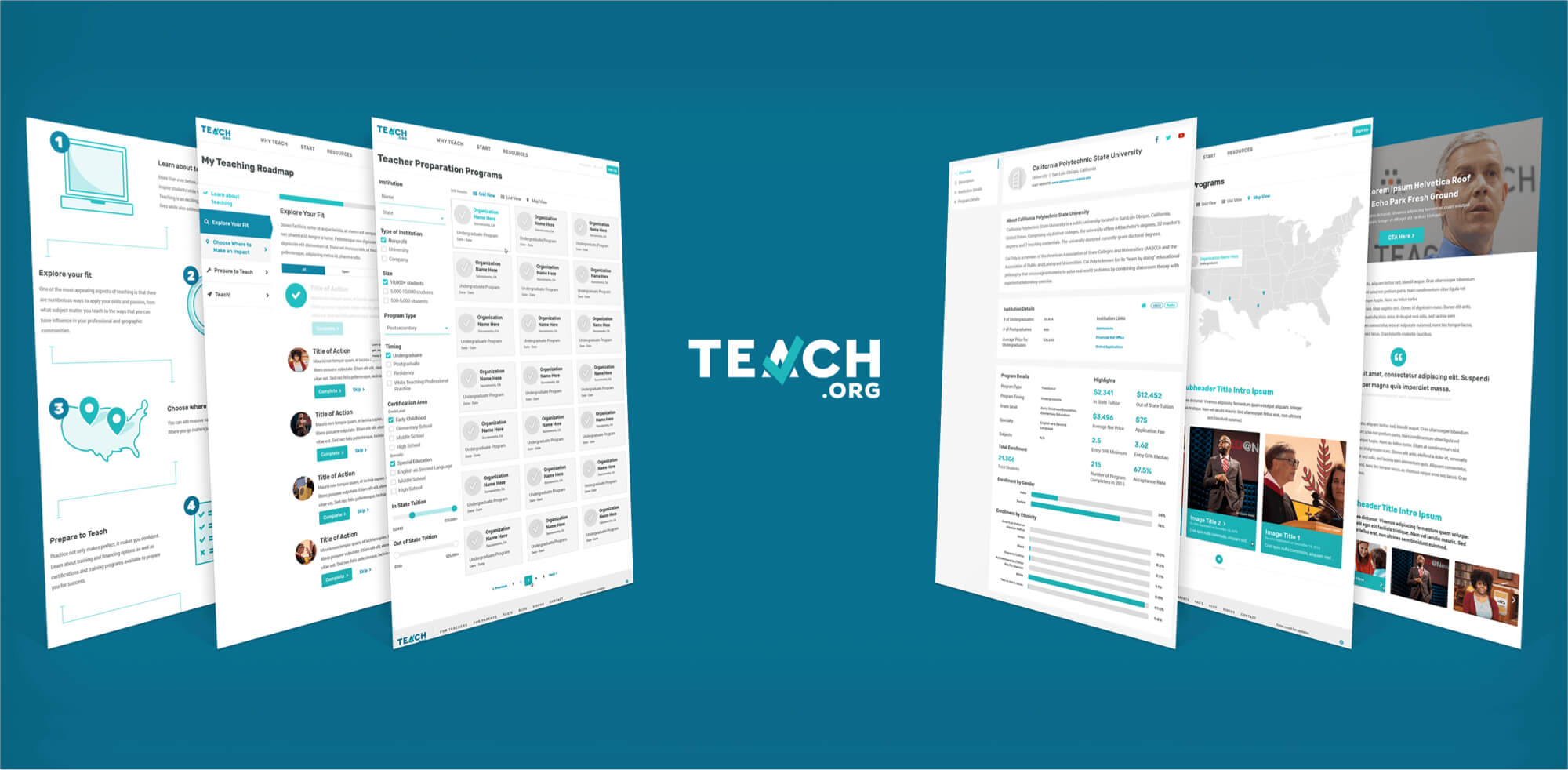
Our Design, UX/UI and Development Teams leveraged Drupal to develop a custom tool that generates personalized career roadmaps for candidates based on their grade level, interests, motives and personal desires.
Matchfire also developed custom functionality that can search all Teacher Preparation Programs and Certification Programs in the U.S. Both custom tools helped to position TEACH.org as the “go-to” and primary resource for those interested in becoming a teacher.
In parallel to the launch of the national TEACH.org site, we launched a microsite for TEACH.org’s Dallas Forth-Worth division.
Over the next few years, TEACH.org plans to expand and will soon offer microsites for all 50 states and hundreds of major cities. The launch was announced during ESPN’s College Football National Championship which garnered over 26,000,000 viewers.

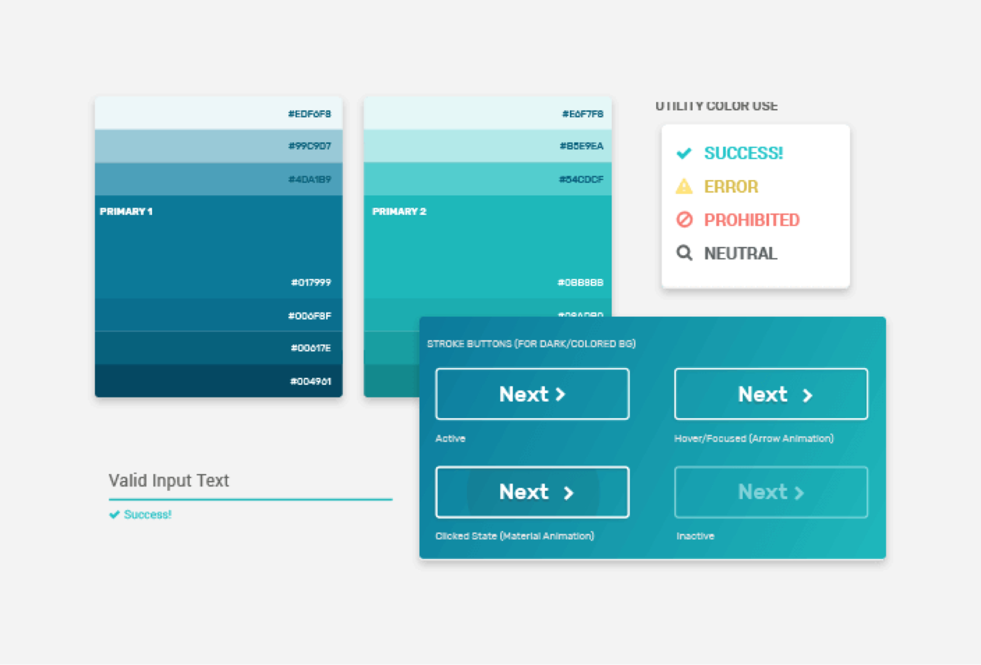
ATOMS
The UI kit helped to stage many of the style choices used for the atoms that would be used throughout the site. These included obvious elements like color and type choices, and extended into other necessary elements like icon, heading, form, button, and cell styles.
MOLECULES
Groups of these atoms then merged together to construct larger elements. For example, an icon, active cell style, and text style came together to create a larger functional molecule. Matching molecule stylings across active, inactive, and hover states ensured that the UI had a singular, cohesive visual language.


ORGANISMS
Molecules quickly formed “organisms,” or components people typically think of when they think of web and UI elements. Design choices made in the previous two steps made this step intuitive, as each atom and molecule naturally came together to form a whole.