Next Practices Group
Helping The Next Practices Group ‘Unlock What’s Next’
Next Practices Group is an ecosystem of creative problem solvers and emerging technologies. With a portfolio of purpose-driven companies and forward-thinking founders, NPG has assembled a conglomerate of like-minded agencies dedicated to advancing the idea that marketing, communications, and psychology tenets can be synchronous, all working together to achieve positive social, cultural, and economic impact.
The Ask
How can we take a one-page, scrolling website being used as a glorified splash page and turn it into a welcoming and informative digital landscape? As a true collaborative of people and companies, the challenge was to present NPG as a single entity without obscuring the individual member companies that make it all work. More than that, how do we elevate these founders and companies to showcase their unique capabilities and forward-thinking business philosophies to prospective clients?
The Solution
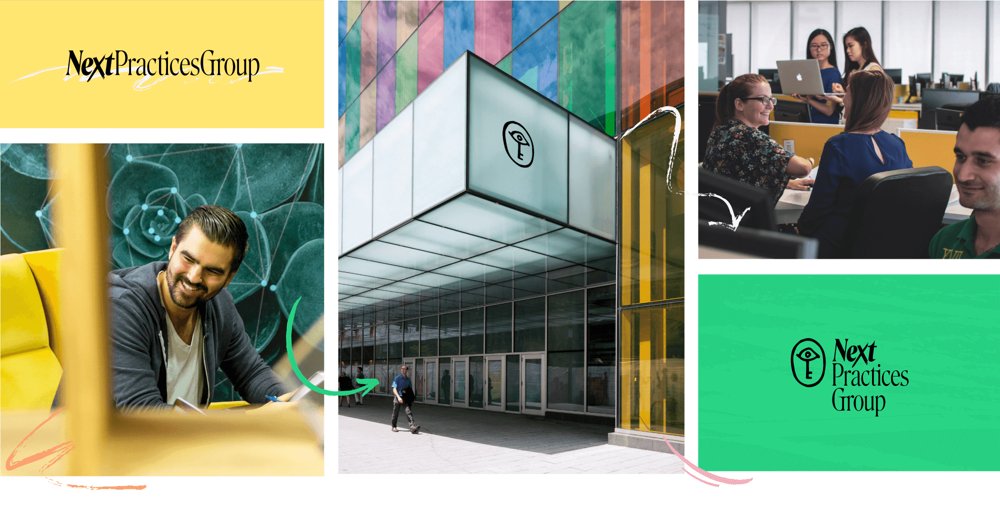
We began with a strong focus on information architecture and UX, mapping primary and secondary user journeys, each leading to a clear, concise CTA. The homepage would need to be a knowledgeable guide for users just getting to know NPG but also highlight clear paths to information that would drive action. Using lively, thematic illustrations and bright colors, the design represents the potential for “what’s next” and invites the user to explore.
The content is laid out to enhance this exploration, offering insights into the makeup of the group and providing multiple avenues to explore each member company’s own website and work. At the same time, to demonstrate the “why” behind its creation we paid special attention to opportunities for introducing thought-leadership pieces and the many contributions by the individuals that come together and push through the barriers of what’s possible in today’s business and communications landscape.
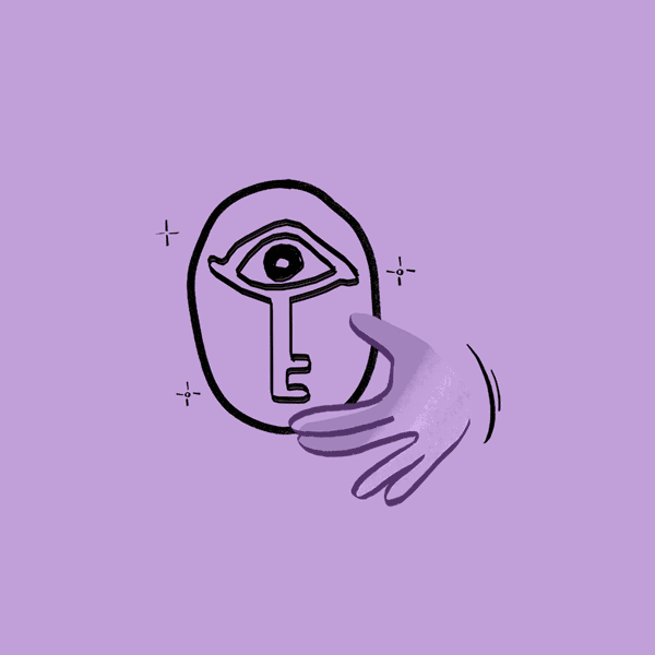
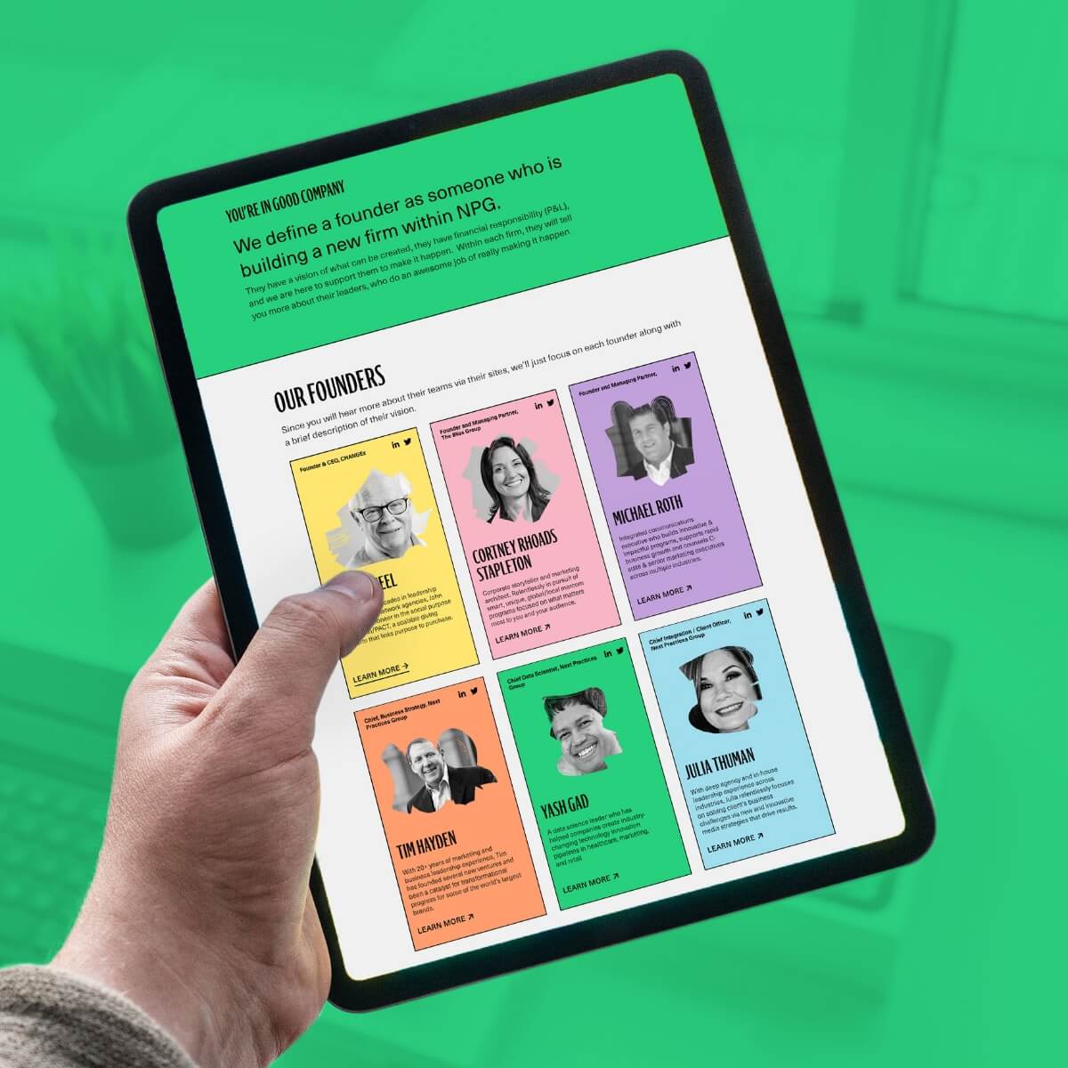
The visual identity creates a beautiful monochromatic aesthetic that most companies in the industry would shy away from entirely. It’s the fearlessness of the design that makes this brand stand out and unlock a door to creativity. This direction pulls inspiration from finding a balance between a bold look with organic elements that makes the brand feel energetic yet impactful. The focus here is strong typography and vibrant colors paired with textured illustrations.