Little Leaves
Bright, Unified Identity for Little Leaves Across All Locations
Little Leaves, a division of FullBloom, provides behavioral services dedicated to supporting children and families. With 14 locations, the organization needed a stronger, unified brand identity to ensure consistency across facilities while still creating warm, engaging spaces for patients and staff. Matchfire partnered with Little Leaves and IMP-SF to develop a refreshed, vibrant brand system that could work across digital, print, and environmental touchpoints.
The Ask
The client’s goal was to create cohesion across all Little Leaves centers while aligning with the corporate identity. They needed a toolkit that balanced professional credibility with playful energy, enabling each facility to implement consistent visuals across environments, signage, and communications. The work had to be scalable, user-friendly for staff, and adaptable to multiple formats.
Our Approach
We began with a discovery and assessment phase, conducting a touchpoint audit, gathering background information, and analyzing competitors to understand opportunities for differentiation. From this, we defined a creative direction rooted in the Little Leaves brand identity but expanded with new color ranges and playful design elements.
Our approach centered on three pillars:
- Consistency: Establishing a brand architecture and toolkit to unify facilities.
- Flexibility: Creating adaptable assets for print, digital, and environmental formats.
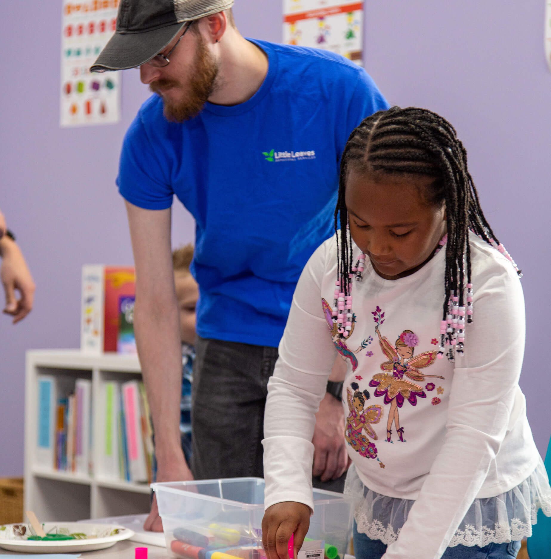
- Engagement: Introducing playful patterns, colors, and signage to enrich the patient and family experience.

Execution
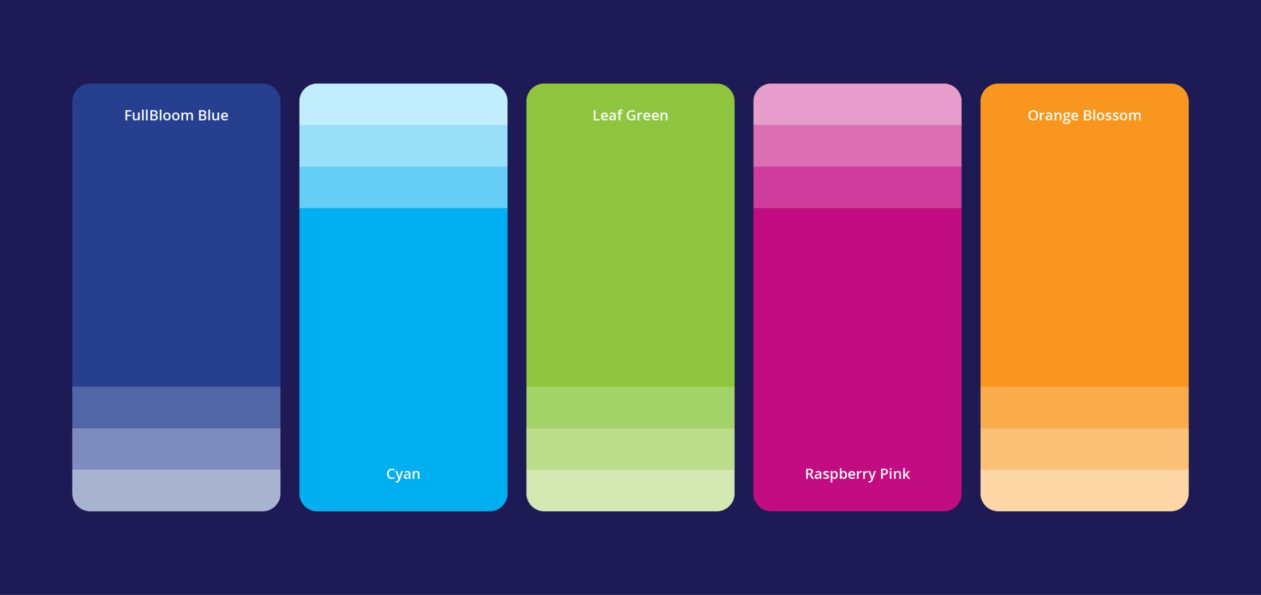
We extended the Little Leaves brand with youthful geometric patterns that added visual energy while maintaining cohesion. The color palette was broadened with lighter shades from the core palette, allowing for use in background floods, new patterns, and environmental applications.
Key creative executions included:
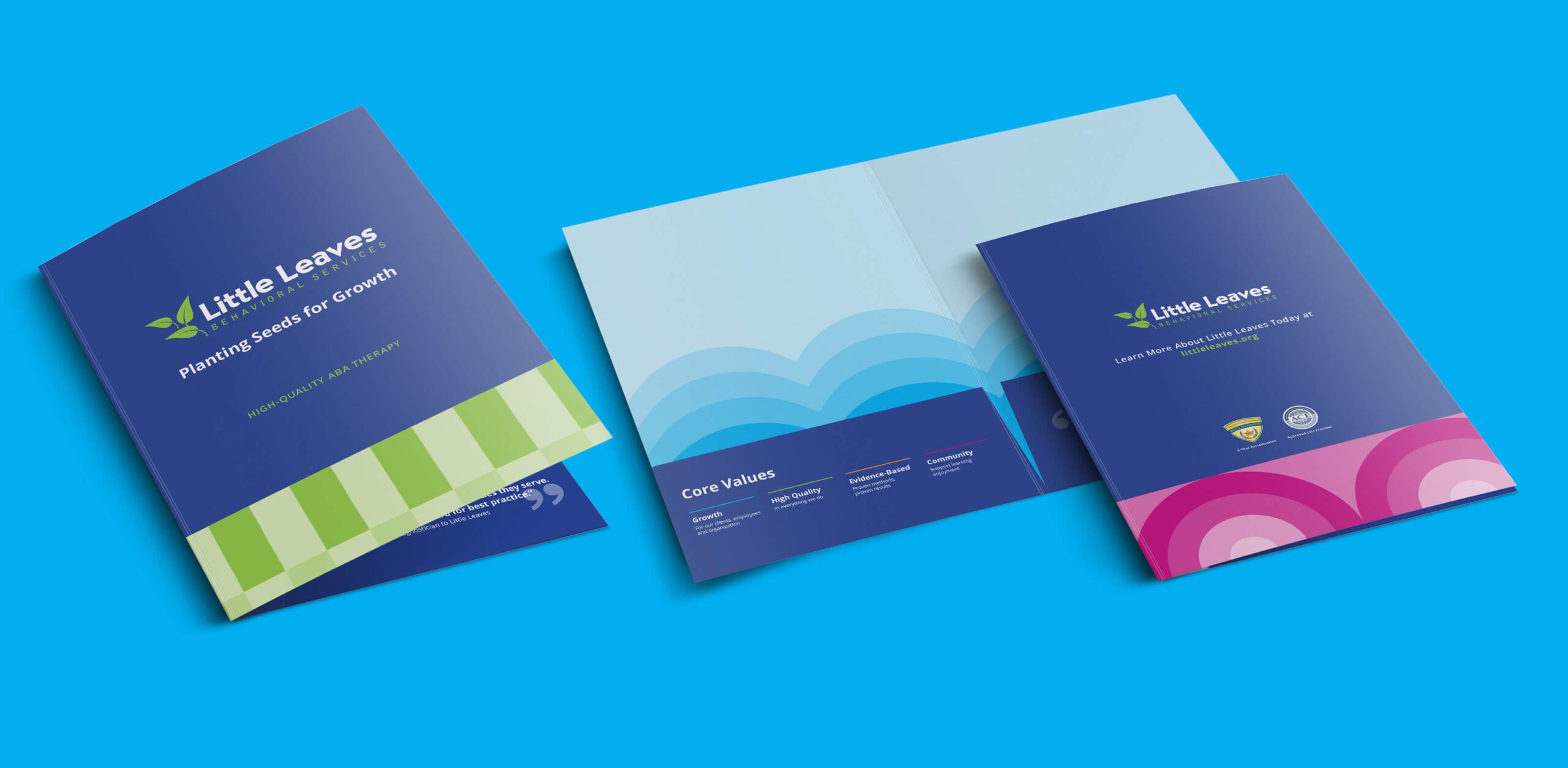
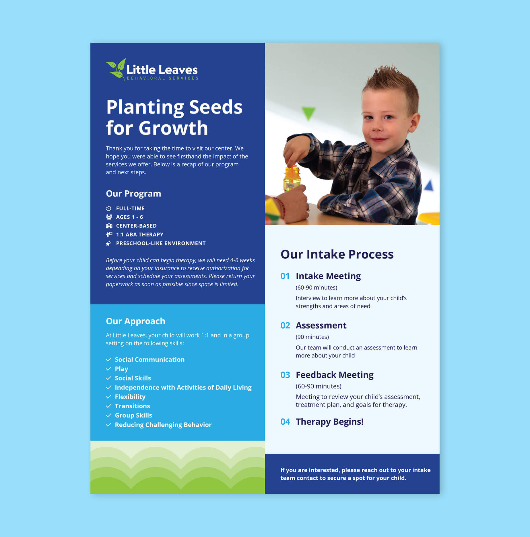
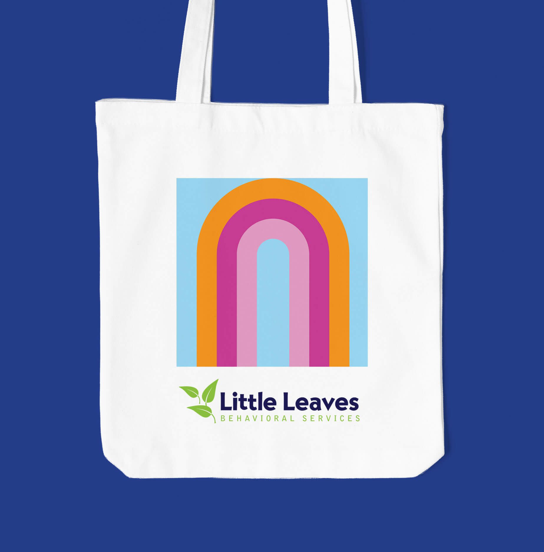
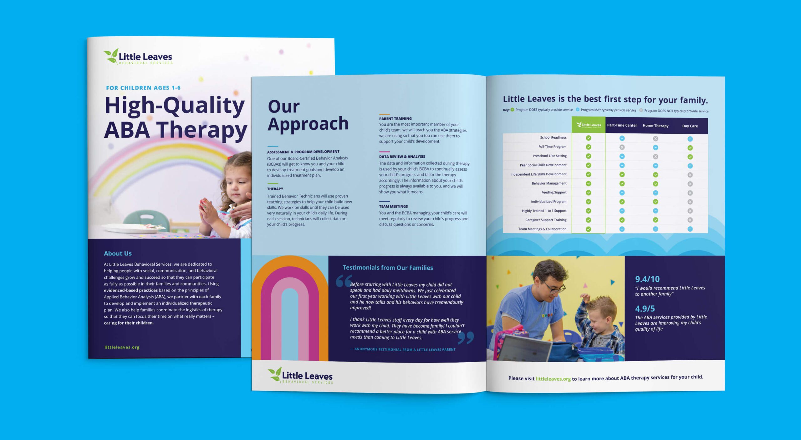
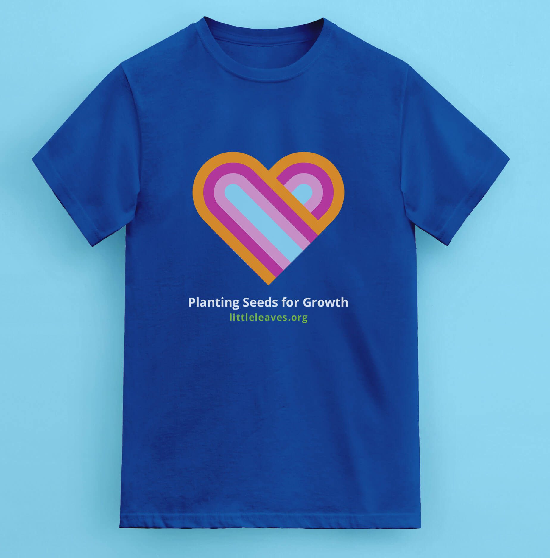
- Print Collateral: Redesigned welcome folders, flyers, posters, brochures, and merchandise such as tote bags and t-shirts.
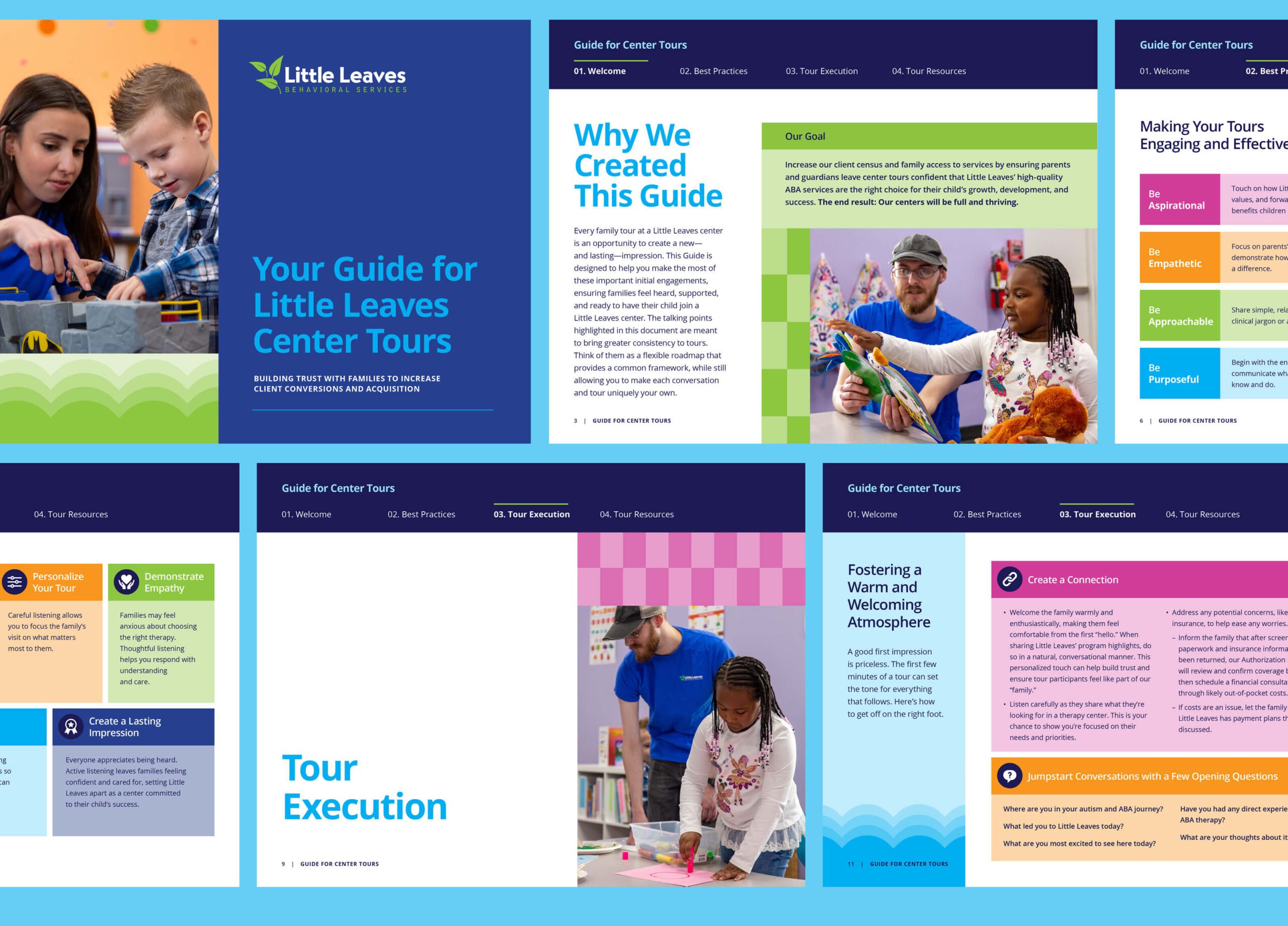
- Digital Materials: A newly structured onboarding staff-led tour guide, with carefully restructured content to support training and enhance the patient onboarding experience.
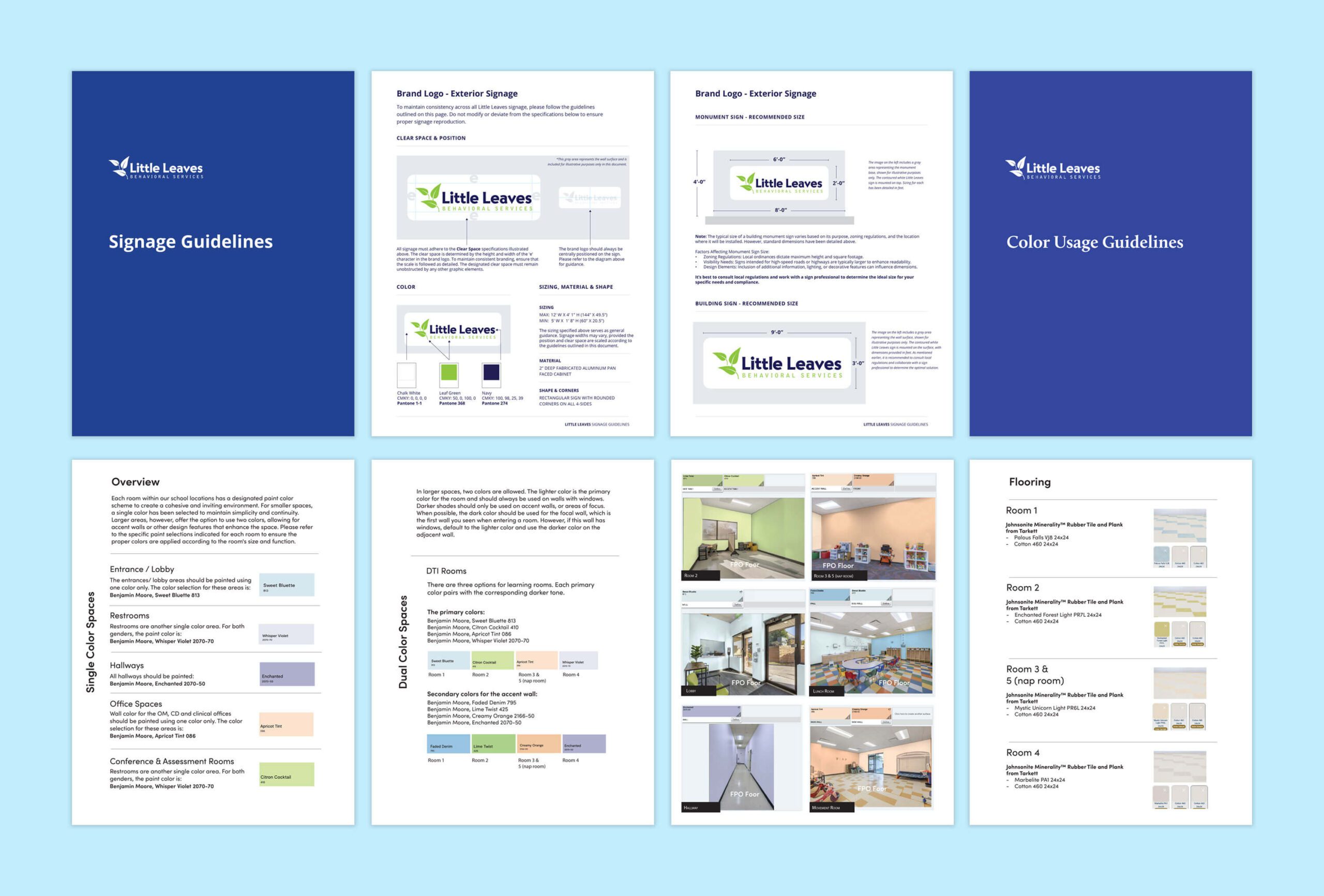
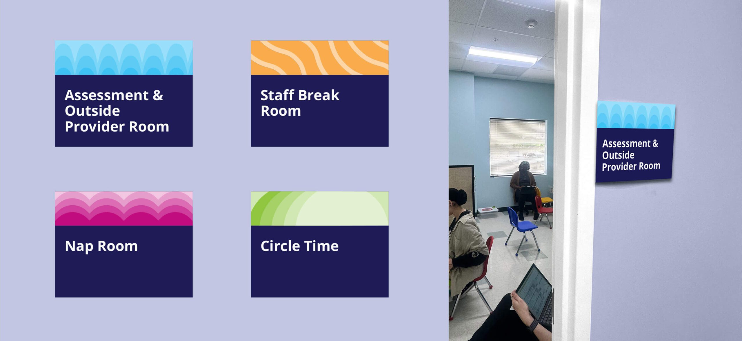
- Environmental Signage: Exterior door signage, classroom activity station signs, and signage guidelines for building exteriors and monument signs to ensure consistency across centers.
- Interior Design Guidelines: Specified wall colors, flooring types, and finishes to create a cohesive look and feel across facilities.
All creative assets were organized into a planogram brand toolkit, making it simple for Little Leaves staff to access approved templates, guidelines, and production-ready files.
Results
The refreshed Little Leaves brand successfully unified 14 facilities under one cohesive identity. The updated visuals provide warmth, energy, and professionalism, strengthening trust with families while empowering staff with clear, easy-to-use materials. From the welcome packet in a parent’s hands, to the classroom signage children interact with daily, the brand now delivers a seamless experience that reflects the mission and heart of Little Leaves.