Garbo
A New Kind of Background Check
Garbo is dedicated to closing the information gap when online dating, interviewing, or meeting new connections in person for the first time. They aim to proactively prevent crimes against women and members of the LGBTQ+ community by providing a simpler, more comprehensive background check.
The Ask
Matchfire was tasked with developing a memorable brand identity and design language for Garbo — conveying the platform’s serious nature in an empowered way. The work allowed us to explore the brand identity connection between femininity and technology.
The Solution
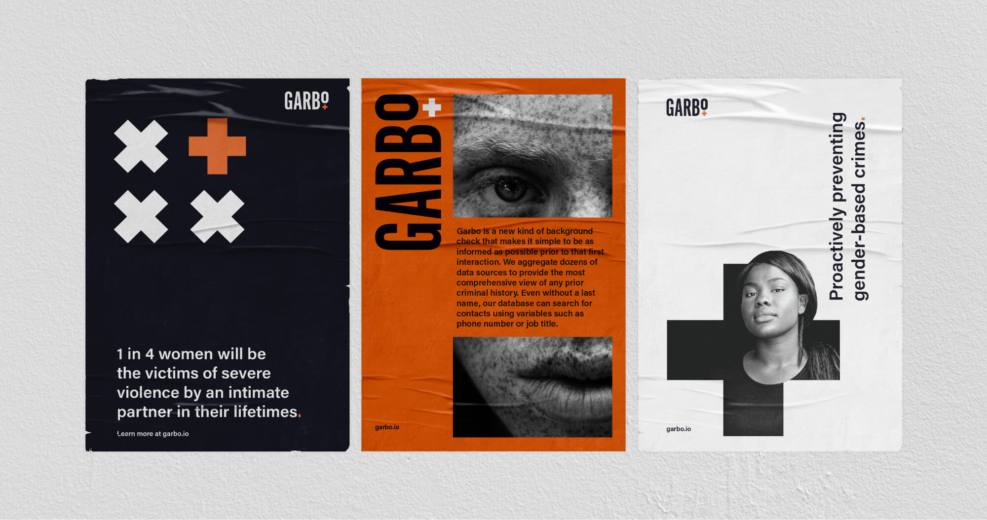
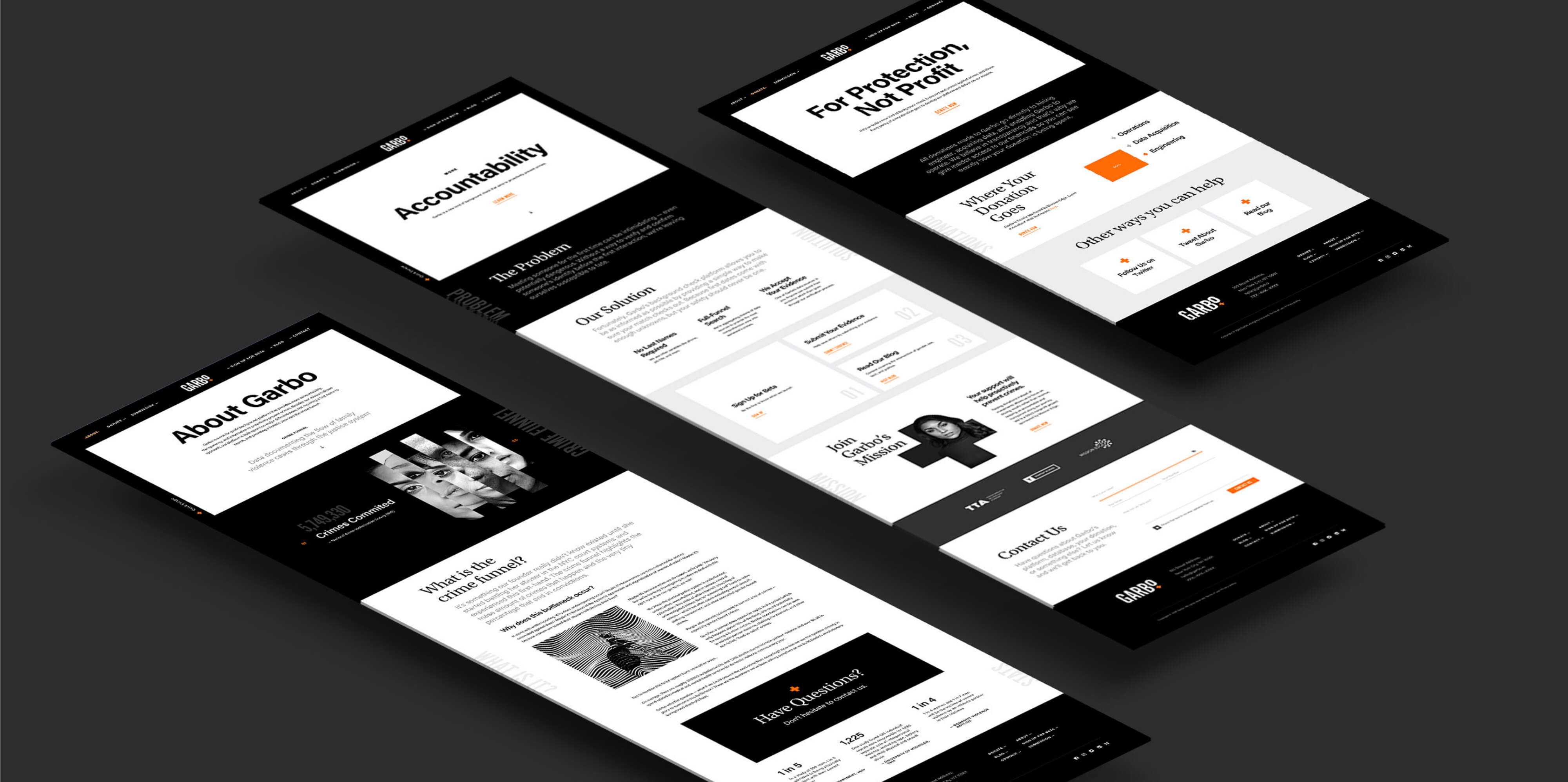
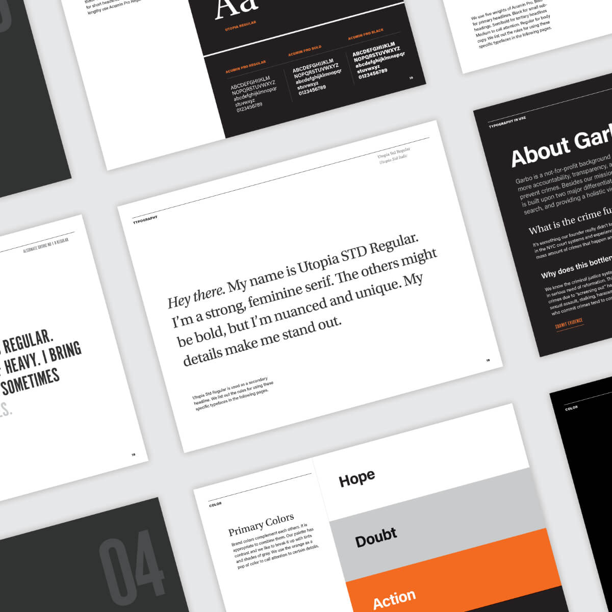
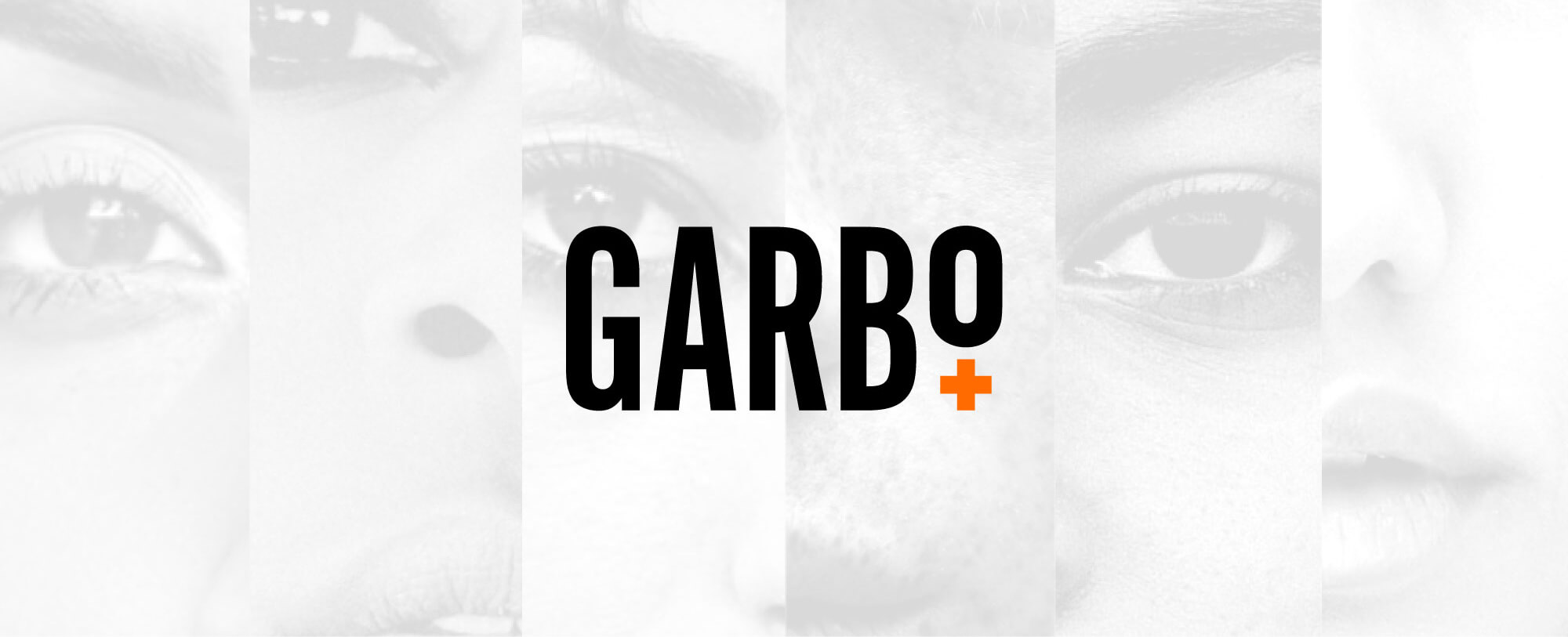
To stay true to Garbo’s desire for promoting transparency, design was kept clean and minimal, relying on thoughtful use of color and typography. Black, white, and shades of gray speak to the platform’s serious nature, while a vibrant orange was selected to represent empowerment. The Garbo brand was built for simplicity and transparency, yet sophistication.
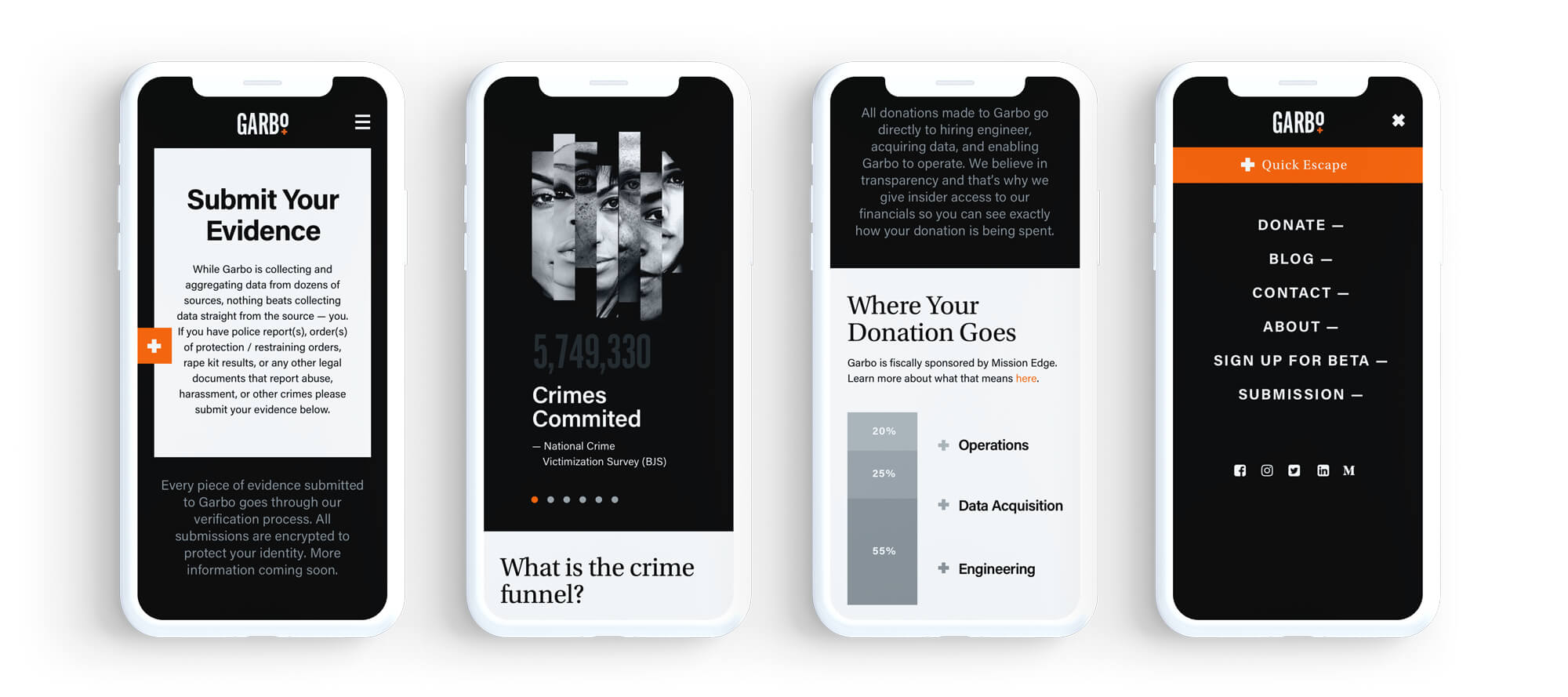
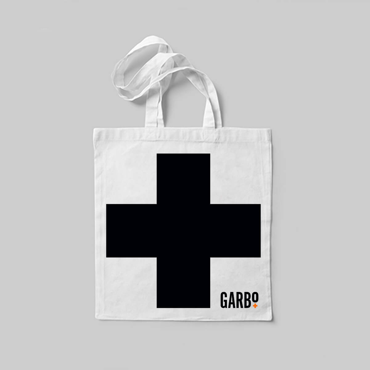
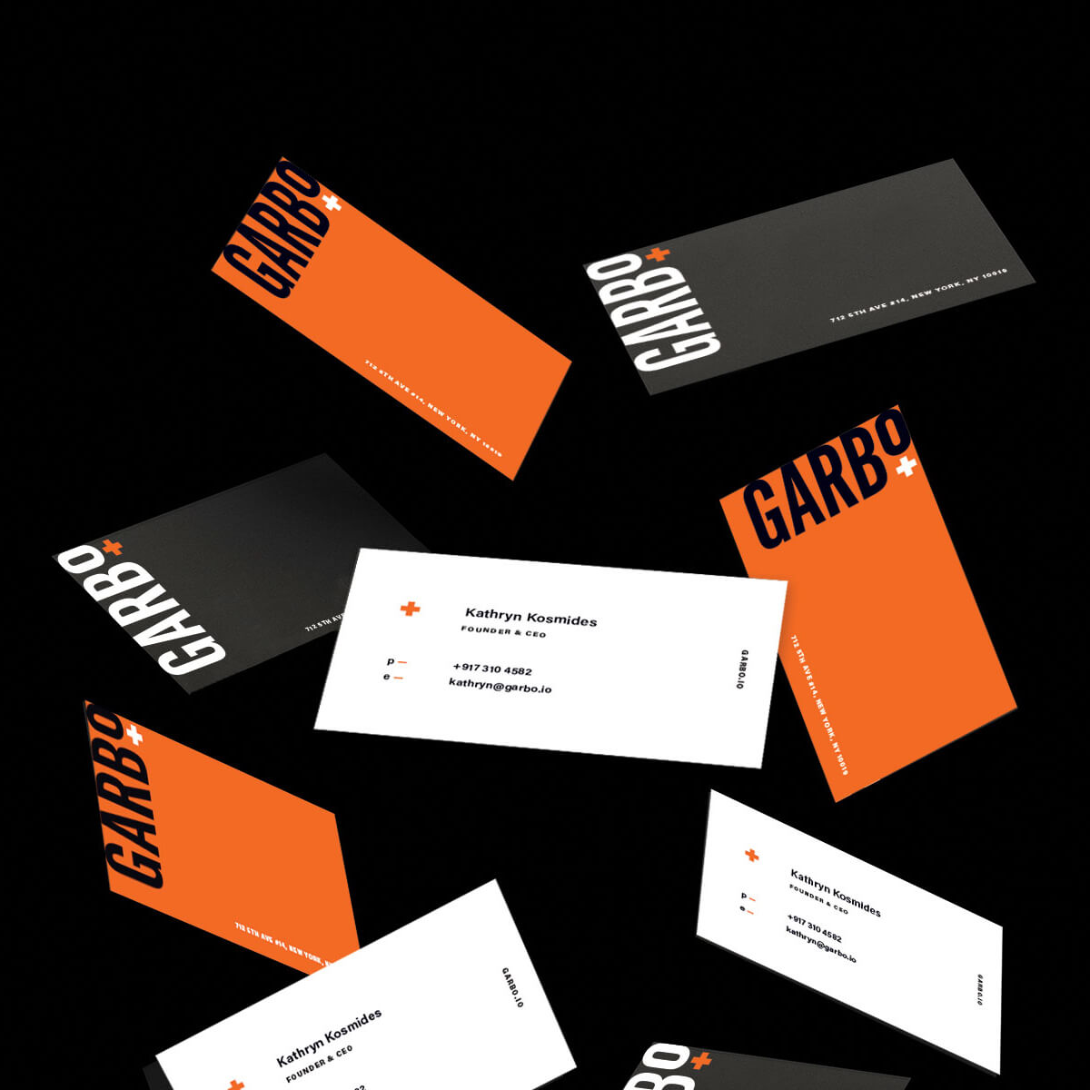
Every brand needs an online and offline presence. Simple nods drawn from the Garbo brand system are adapted across multiple properties.
The Award
Matchfire received a Dallas Society of Visual Communications award for the Garbo Brand Style Guide. The Dallas Show recognizes and honors the region’s top creative work in advertising, design, interactive illustration and photography. Matchfire provided branding, digital design, sponsorship strategy and project management for Garbo’s initiative.