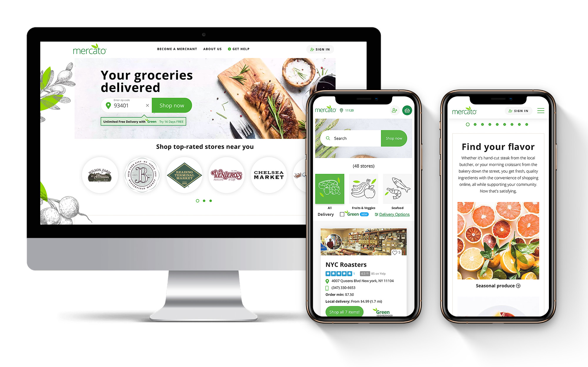
Mercato // UX Deeper Dive
Improving the grocery delivery shopping experience.
Online grocery shopping is a competitive industry. Tech giants such as Amazon, Uber, and InstaCart have a tight hold on the market. Mercato, an online grocery delivery service for small speciality markets, had experienced tremendous growth and traction within their first 12 months of operation. The startup focused on delivering your favorite speciality items to your door, found itself in the early stages of becoming a viable challenger brand within a niche market.
Problem Statement
Mercato’s next round evaluation and funding was dependent upon key performance indicators that measured growth and optimization of the platform. To help Mercato achieve these goals, we needed to deploy a new look and feel, optimize an underperforming mobile experience and fix the overall user flow across the site. There were three major factors we had to consider when planning.
- Due to the complexity of Mercato’s backend we had to approach the changes in stages. The backend built by Mercato’s tech team integrated with their own proprietary software that connects into a small grocer’s POS system, coupled with a separate front-end with two separate experiences – one for the merchant (grocer) and another for the end-user (customer).Matchfire delivered HTML, JS, and CSS files in fully functional packages and Mercato’s engineering team would integrate with their software. It allowed for much more responsive pages to be created as the engineering team could easily integrate in as templates rather than having to worry about any responsive or UX aspects.
- User testing was critical to the Mercato team. They wanted to reskin and improve the site in stages as noted above, but they also wanted to a/b test small improvements along the way to better gauge user engagement. They wanted to be sure they had the right UX solution before they rolled it out across the site.With the HTML that we delivered being semantic and well structured it allowed for user testing tools to be automated and easily integrated without additional technical work. Testing went much quicker than before Matchfire was engaged.
- Develop a solution that works for both audiences, the merchant and the customer, as they both have different needs.
Audience
- Merchants who have partnered with Mercato, who are paying a fee to be on the platform. They want to see their store represented on the site and have been sold on the fact that more people can access their speciality goods unlike before. They have the ability to load their products to the platform.
- Customers are shopping with Mercato because, unlike the larger competitors, Mercato delivers foods from your favorite local merchant or speciality store. A dream came true for those craving the best homemade mozzarella from a store that has been in business since the early 1900s.
Our Approach
Our traditional approach to building websites and planning for UX often involves a deep dive into a company’s digital presence which includes but is not limited to, Google Analytics analysis, user tracking analysis, backend development review and audit, outlining functional requirements — on top of stakeholder interviews, sales trends and analysis and any deep dive into the brand. In this instance, we had limited time. Our qualitative research included stakeholder interviews along with merchant and customer surveys. The quantitative research had a direct focus on user behavior tracking using both HotJar and Google Analytics.
Research Testing Tools:
- HotJar User Behavior Tracking
- Google Analytics
- Merchant and customer surveys
In HotJar we setup heatmaps, click paths and several funnels to study the exact behaviors. We knew where people were dropping off and/or experiencing pain points. Watching these behaviors allowed us to strategize opportunities to optimize the experience on desktop and mobile.
Key Findings
- The site was optimized for merchants, not customers
- The merchant list with featured products was often overlooked
- Customers went straight to search despite a page of merchants and products to discover
- Customers were always looking for something specific when searching
- Key CTAs like “see all items” were being overlooked on mobile
- There were too many top-level categories that were not being utilized
- Significant drop-off on mobile at the cart level
- The pop-up free delivery was affecting the user flow
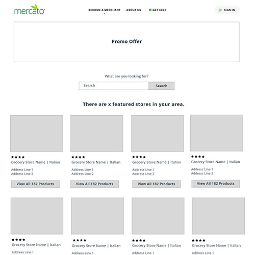
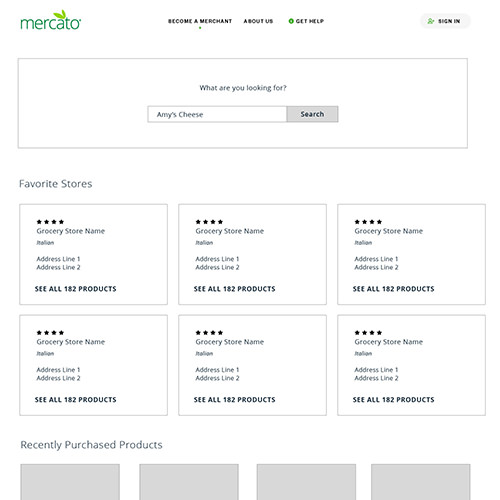
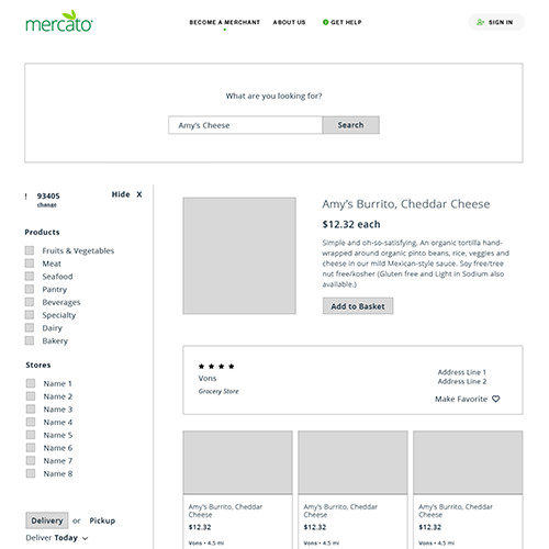
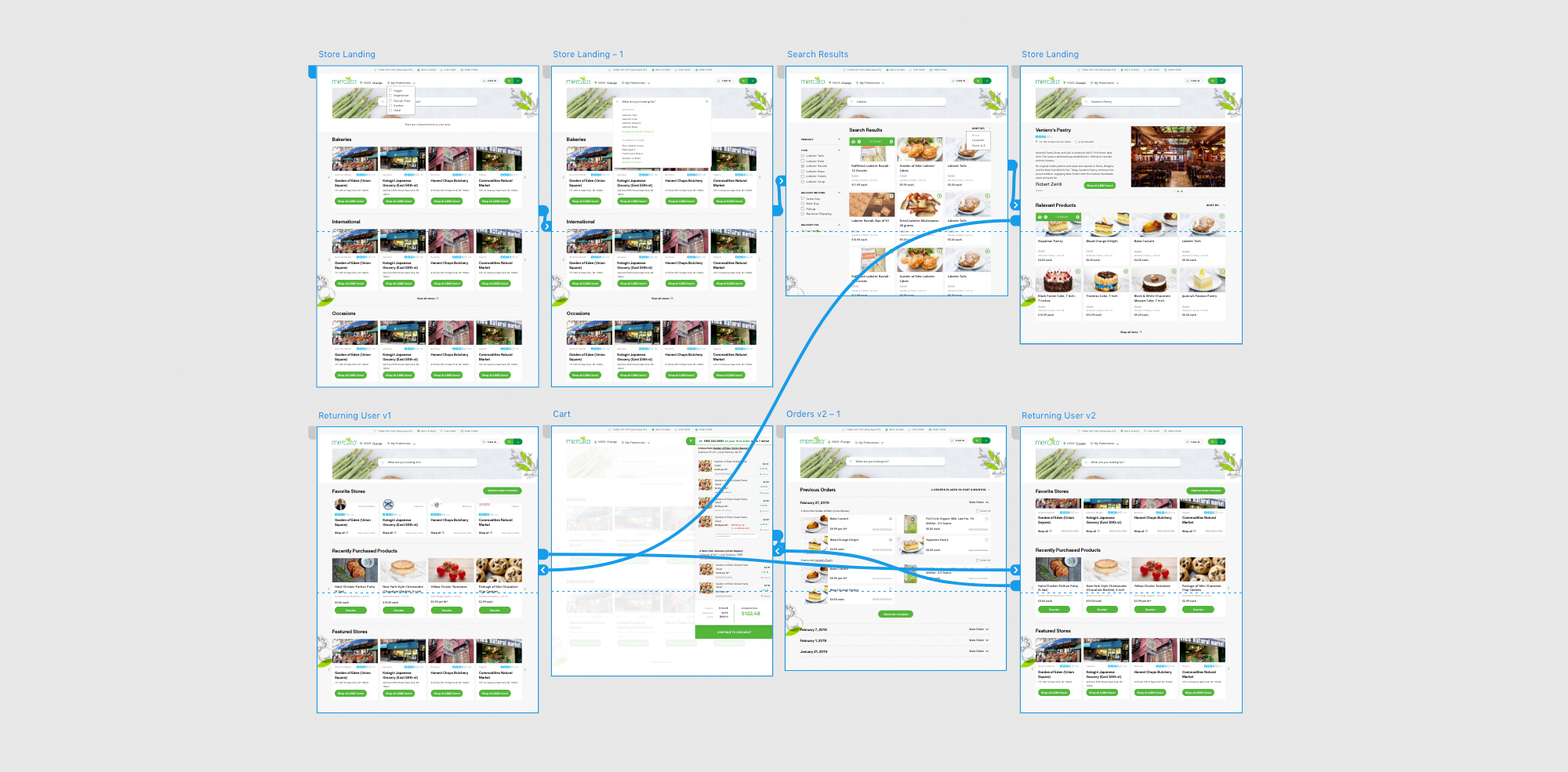
Example User Flow Recommendations
Since the majority of users are clicking search, the obvious assumption is people are looking for something specific >> consider a user flow that works something like this: A user enters a zip code and is taken to a page that says, there are x amount of stores in your area. What are you looking for? With a search bar and an option to browse stores.
User searches for product >> The search results would be a page of all products available. Once a user selects an individual product, more items from that store are shown. Helper text to explain the benefits of shopping one store only can be cued to help the user.
User selects to browse stores >> Only store cards are shown with location, reviews, and area of specialty (deli, Italian, Jewish, baker, etc). User clicks store and sees all products within that store. Helper text to explain the benefits of shopping one store only can be cued to help the user.
Returning users would see this >> What are you looking for? With a search bar and an option to browse stores. And would also see recently viewed products and stores as applicable.
Testing
We ran tests on the following:
- Product card sizes and placement
- Store feature
- Category callouts like best selling, popular in my area, new items, featured
- Button size and color
- Text callouts, size, color
- Feedback module on the site
Next steps were to utilize our research findings to strategize the roll out of global changes and set priorities for a/b testing.
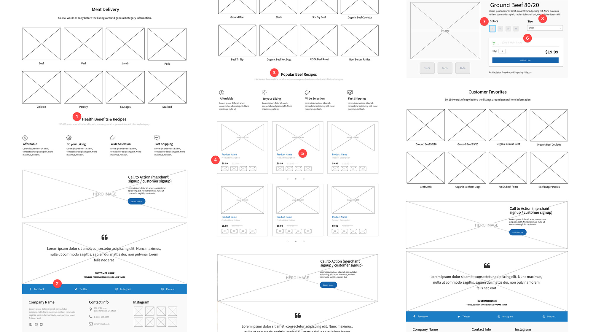
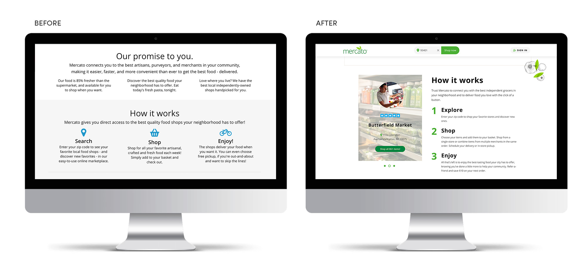
Implementation
We worked with Mercato’s development team to implement and test the theories. We reskinned a majority of the pages and provided several high-fidelity wireframes for each of our recommended tests.
Result
The Mercato team is still testing a variety of the UX recommendations we made. Overall sales have increased by 150% year over year and they’ve expanded into several new markets in major cities across the U.S.