MarketAxess // UX Deeper Dive
Rethinking the leading bond trading platform.
MarketAxess is the leading bond electronic trading platform for institutional investors and dealers around the world. Their relatively fast growth reflects a broad shift in fixed-income markets. Financial-technology companies that control data and digital networks are displacing investment banks and brokerages that use capital and personal relationships to dominate trading. Their purpose is to use their technology and vast electronic network to make global credit markets work better for the people who depend on them.
Problem Statement
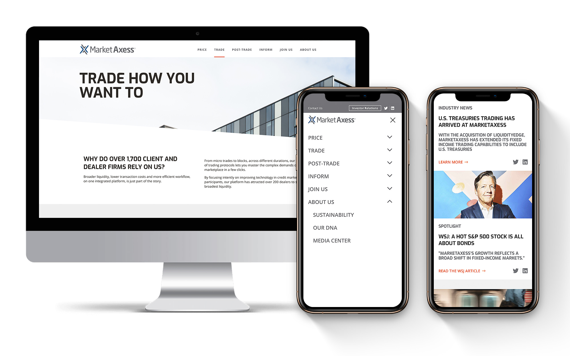
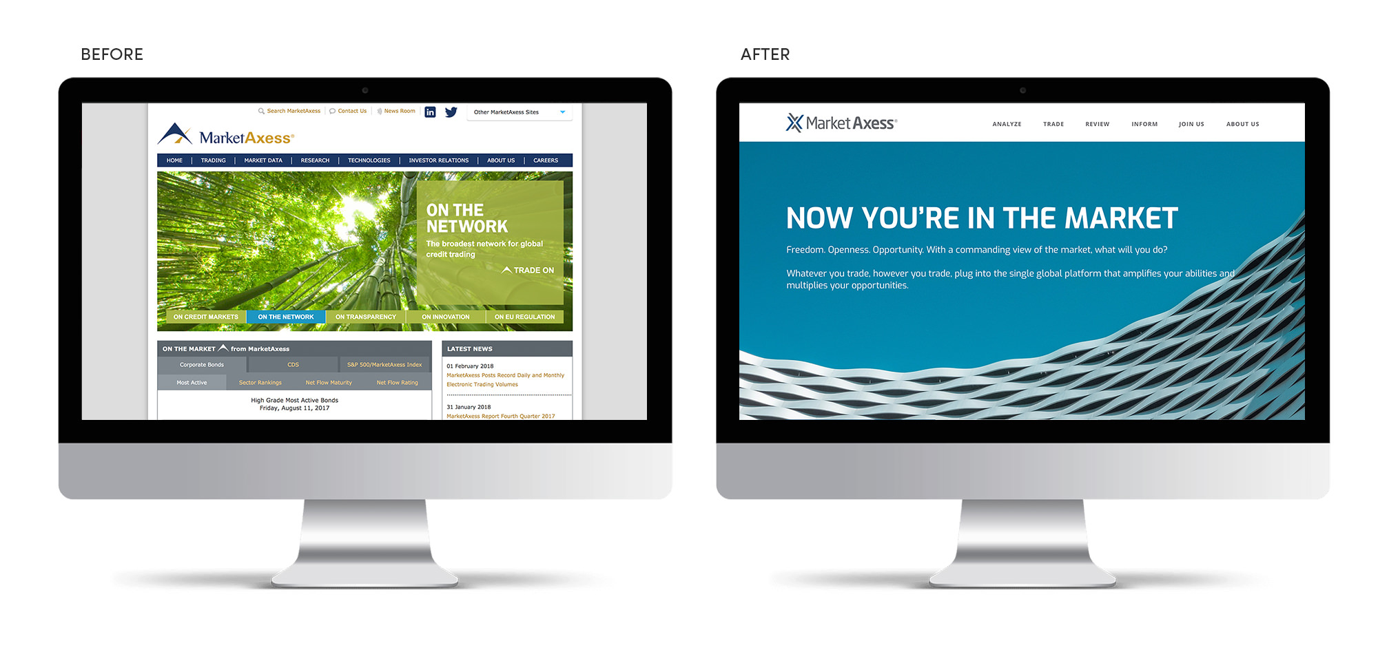
Up until the engagement with Matchfire, the MarketAxess website was primarily used for legal and financial documentation for the investment community. MarketAxess approached us to create a responsive, user-friendly site, improving content organization and site navigation. Their outward goal was to generate more qualified leads – consumers and attract potential employees. Internally they needed a modern component-based site that would allow their marketing team the ability to create unique pages that fit their new brand and aesthetic with accessibility, responsiveness, and SEO in mind. Security was also a high priority; the financial space is often targeted so they needed a partner that understands both a strong frontend and a secure backend to create their new site.
Audience
- Financial Investors looking for the latest data on the markets
- Legal Regulators
- New Potential Employees
- New Sales Opportunities
Our Approach
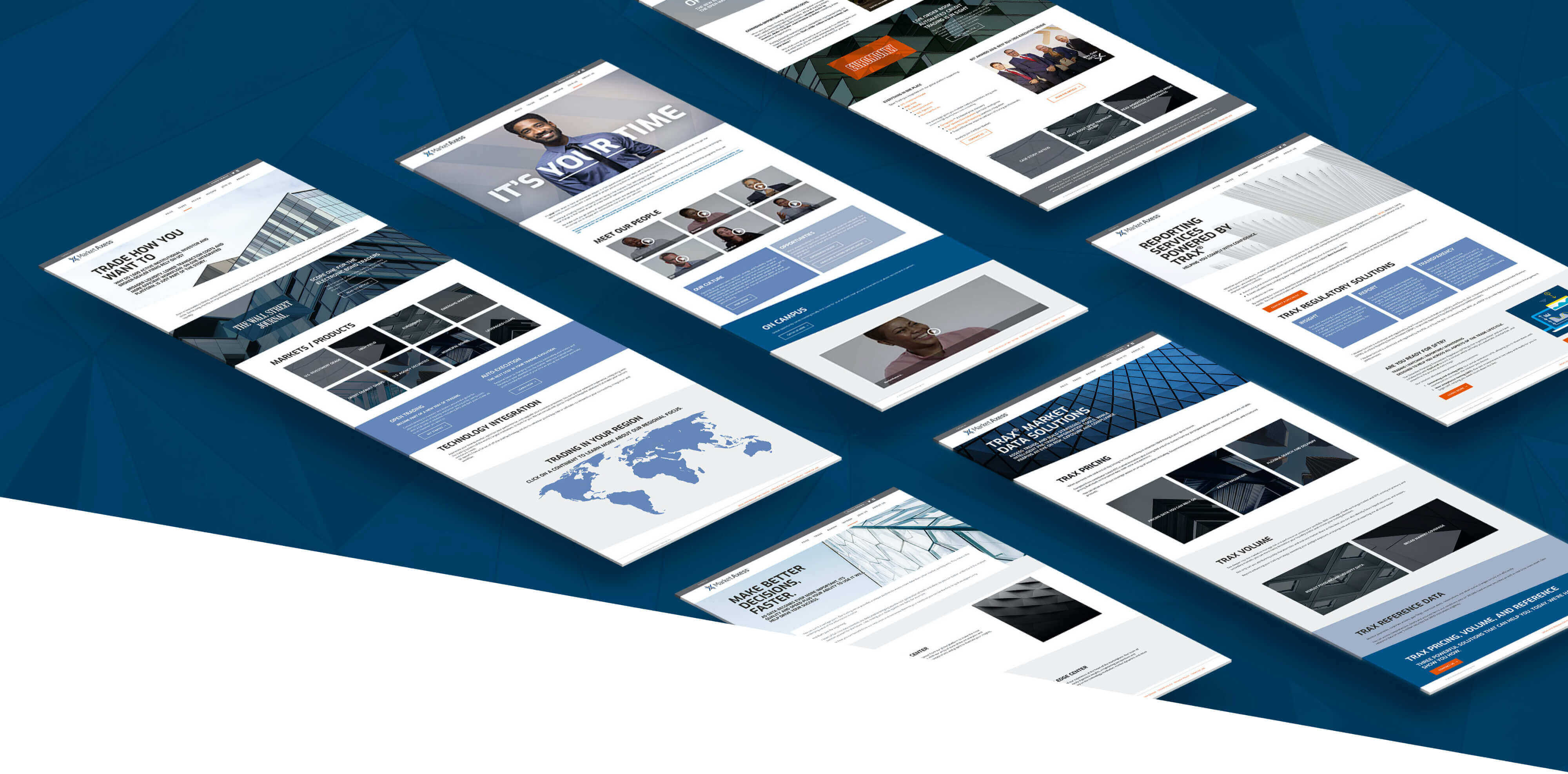
MarketAxess subscribes to an Agile philosophy and since their original site was structured completely differently, with different goals in mind, it allowed us to approach the site redesign in a very iterative way. Rather than our typical approach of a full discovery, MarketAxess preferred that we quickly develop a component-based site that would start out fairly small but grow quickly with their Marketing team taking the lead on creating the various pages. We outlined an overall site structure that evened out the site to focus on trading, information, jobs/culture, and then information about MarketAxess itself.
Key Findings
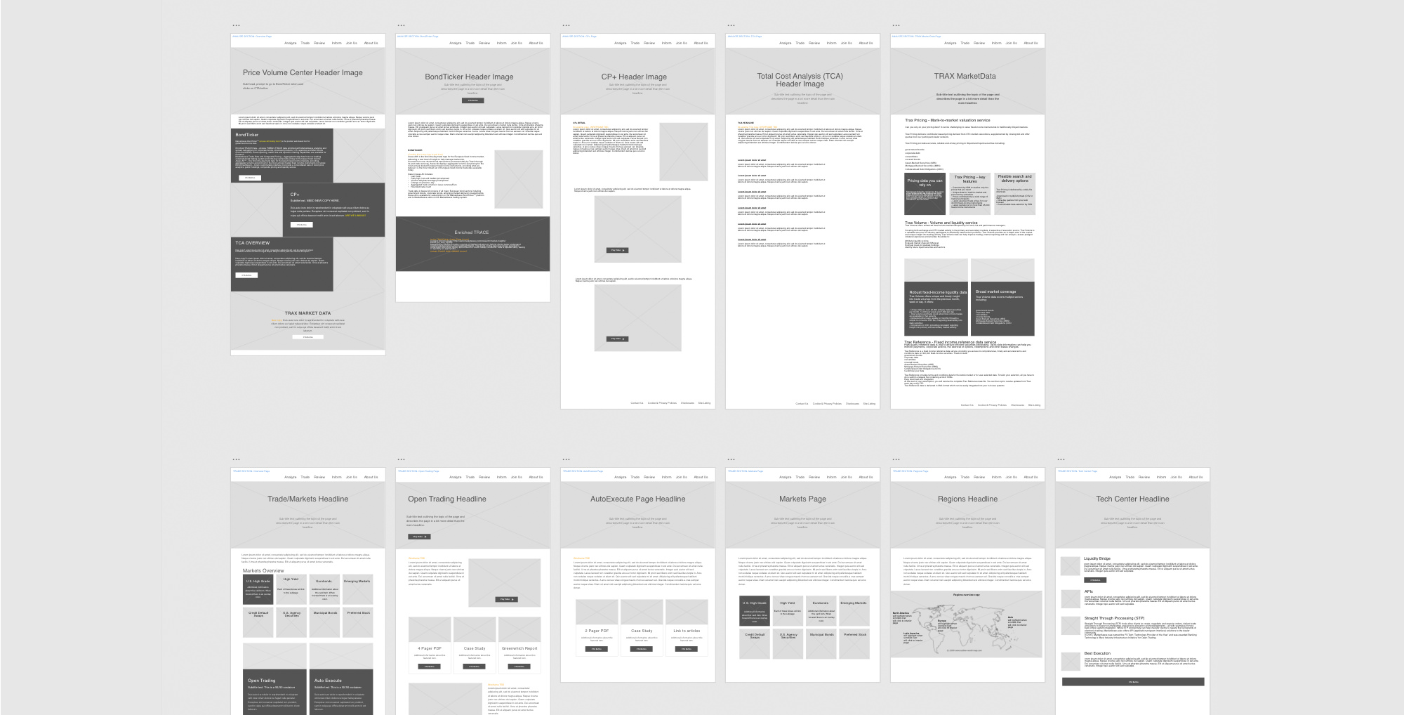
- Each page on their site was customized and disjointed.
- Lack of site cohesion and smooth user flows from a technical and brand standpoint.
- Pages were content-heavy and educational with few visuals.
- Pages were dated, creating a mismatch with a “hip technology company.”
- Internal landing pages garnered more visits than the homepage.
- Mobile use on the site was increasing rapidly, but desktop still exceeded by almost one-third.
- Content hierarchy both visually and within the site’s code was unclear, and difficult to find important content due to the volume of pages on the site.
- Out of 400+ pages, only a select few were being used.
- Although viewing a lot of pages, visitors were not converting or spending much time on any one page.
- Across the site, there were too many steps (clicks) to complete important actions.
- Site navigation was extensive and tiered between multiple levels in a top-nav and side navigation.
- Pages and elements were not responsive and certain actions were inaccessible on mobile devices.
User Flow Recommendations
Based on our findings, we outlined structural and navigational elements that included:
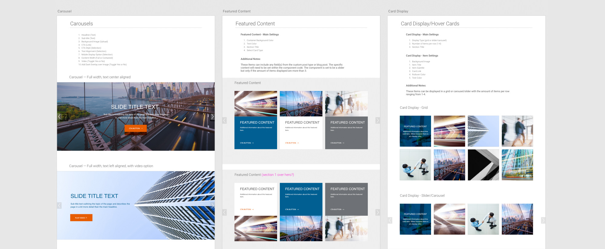
- Photocentric components that fit their new brand, while still being accessible.
- Simplified two-tiered header menu focused on main landing pages and structures.
- Overall implement a structured set of landing pages with minimal content that drives to specific content pages for an engaged user.
- Create a homepage focused on their three targeted user tiers (Traders, Dealers, Researchers) that provides information quickly and above the fold, and spotlighting MarketAxess and making a direct request to job seekers below.
Implementation
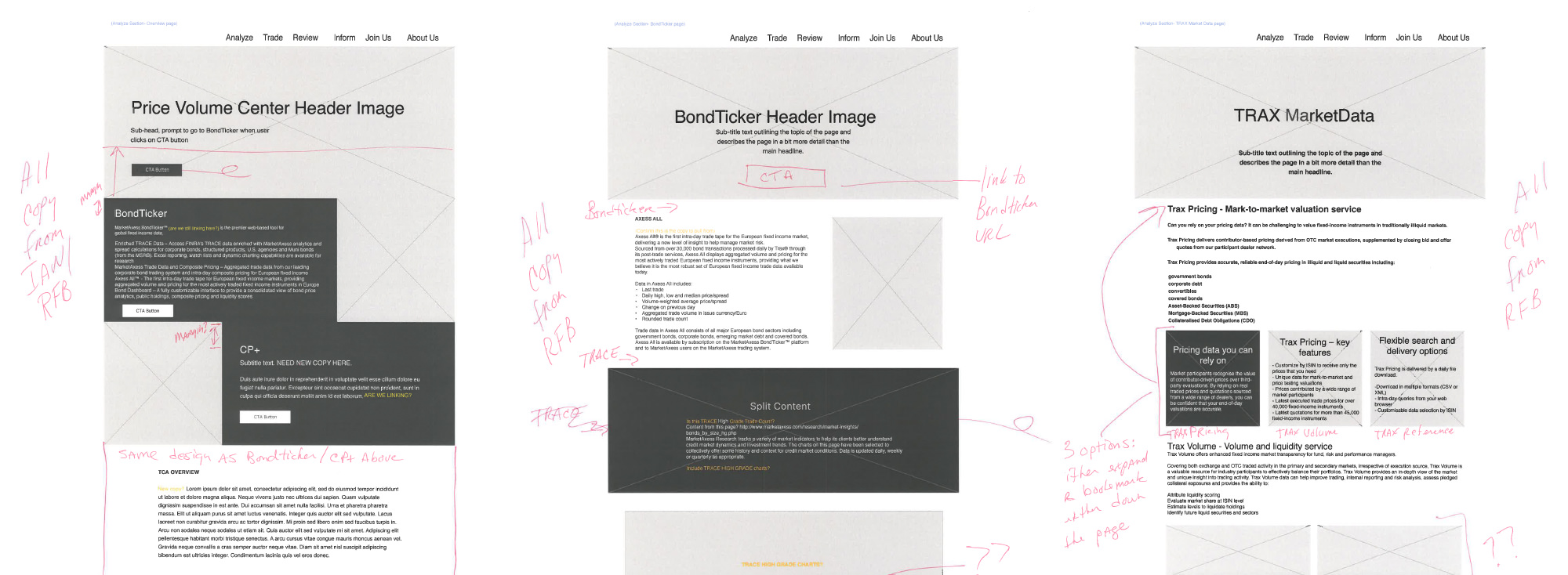
First off we realized that due to security, a headless site would be ideal. The CMS is completely separate from the frontend. React components were then outlined using our experience of what each website needs. Next, a digital style guide was derived from their overall brand style guide and then utilized throughout our work to assure that all elements were completely on brand. Each component was wireframed out individually to evaluate the various sets of options each component would have. The goal was to centralize overall design and separate that from functionality. Once a component was approved we build out the complete frontend, tie into the backend APIs and then deploy to the site for testing and use. We still maintain this process two years later with them for every new component we build. They manage all the content and we architect and build the components.
Iteration & Testing
There is a large amount of analytics on the site and we work closely with MarketAxess in communicating where they can improve their overall conversion rates and user flows to meet their goals. We visually watch user behavior on HotJar and in an Agile fashion make quick updates and test and evaluate again.
Result
The MarketAxess team continues to grow quickly and attract new talent and customers while iteratively growing their site. Their marketing team continues to be able to create content without any technical knowledge. Mobile use has now exceeded desktop and the site has adapted as we hoped. They are exceeding their goals and continue to be happy with the results Matchfire brings.