SESI
Fresh Identity Inspires Cohesion Across SESI Schools
Specialized Education Services, Inc. (SESI), a division of FullBloom, supports more than 7,000 students across 600+ districts nationwide with specialized education and therapeutic solutions. Despite its breadth, the organization faced a fragmented brand identity: school sites looked and felt inconsistent, program pathways lacked visual cohesion, and the overall student and parent experience did not reflect the trusted, evidence-based expertise SESI is known for. A unified brand system was needed to communicate SESI’s compassionate, structured, and student-centered approach, while ensuring consistent application across diverse school formats.
The Ask
SESI partnered with Matchfire to develop a unified brand identity and toolkit that could be deployed across all school environments. The objectives were clear:
- Strengthen brand equity with consistent signage, templates, and physical environment elements.
- Build a flexible toolkit that schools could easily apply in classrooms, offices, and communications.
- Deliver a comprehensive planogram to guide long-term implementation and preserve brand integrity.
- Create a structured, recognizable visual identity for SESI’s learning pathways, Bloom, Spring, and Spark.
Our Approach
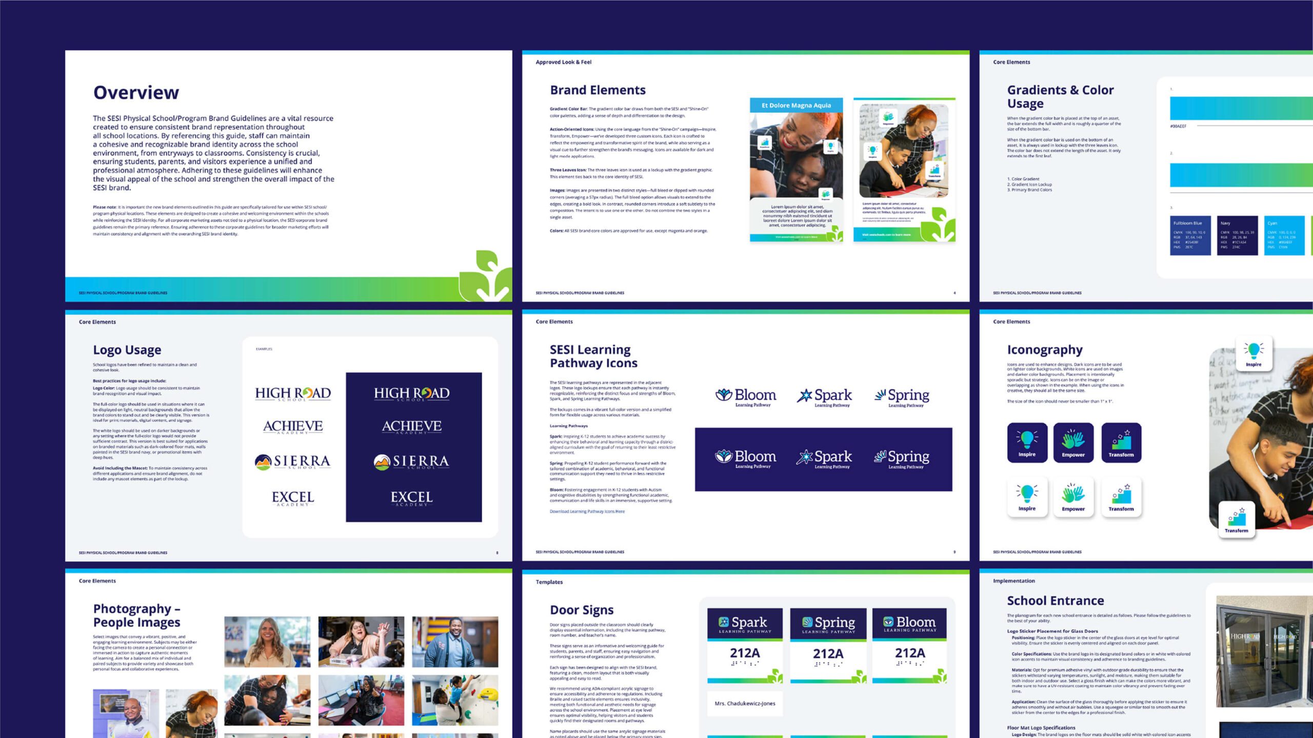
We began with a discovery and assessment phase, auditing SESI’s current brand assets and physical touchpoints across multiple school locations. This included competitive analysis, stakeholder input, and a review of existing corporate branding. Insights revealed two critical challenges: a lack of cohesion in the way SESI schools presented themselves physically, and a disconnect between the learning pathway models and how they were visually represented.
Guided by SESI’s vision to inspire, educate, and support individualized learning, Matchfire developed a creative direction rooted in consistency, inclusivity, and clarity. Drawing on the organization’s existing brand personality, compassionate, confident, and supportive, we designed a system that could unify the diverse school network while leaving room for local flexibility.


Execution
Our design solutions focused on creating cohesive visual elements across every level of the SESI brand experience:
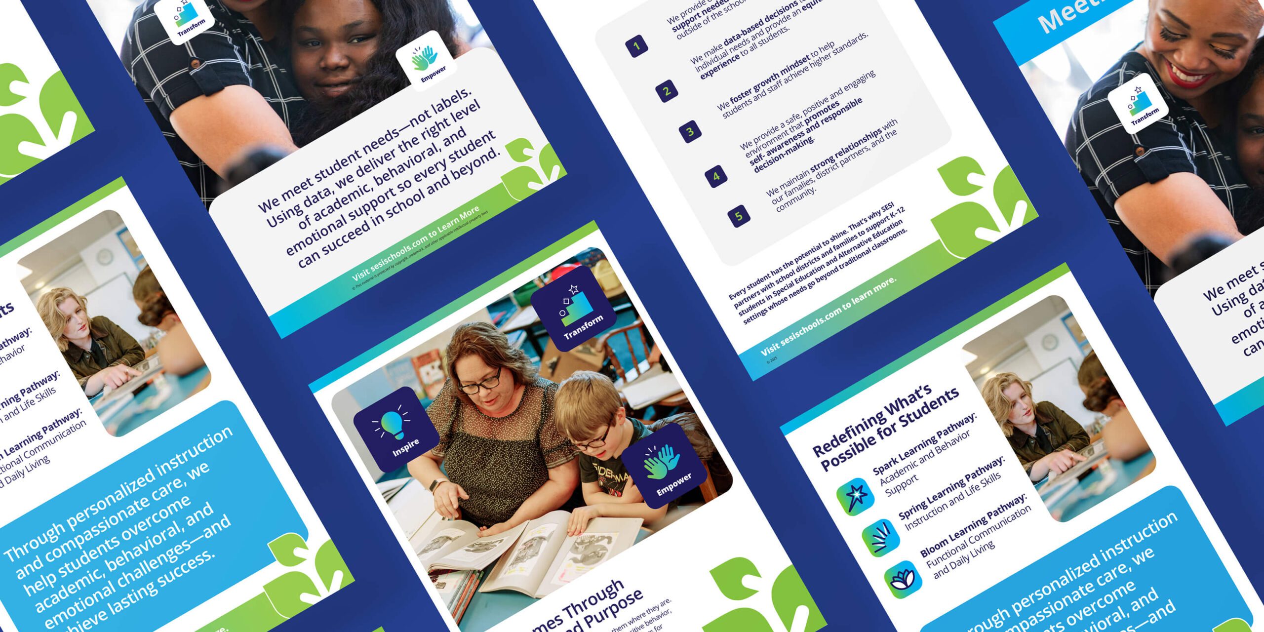
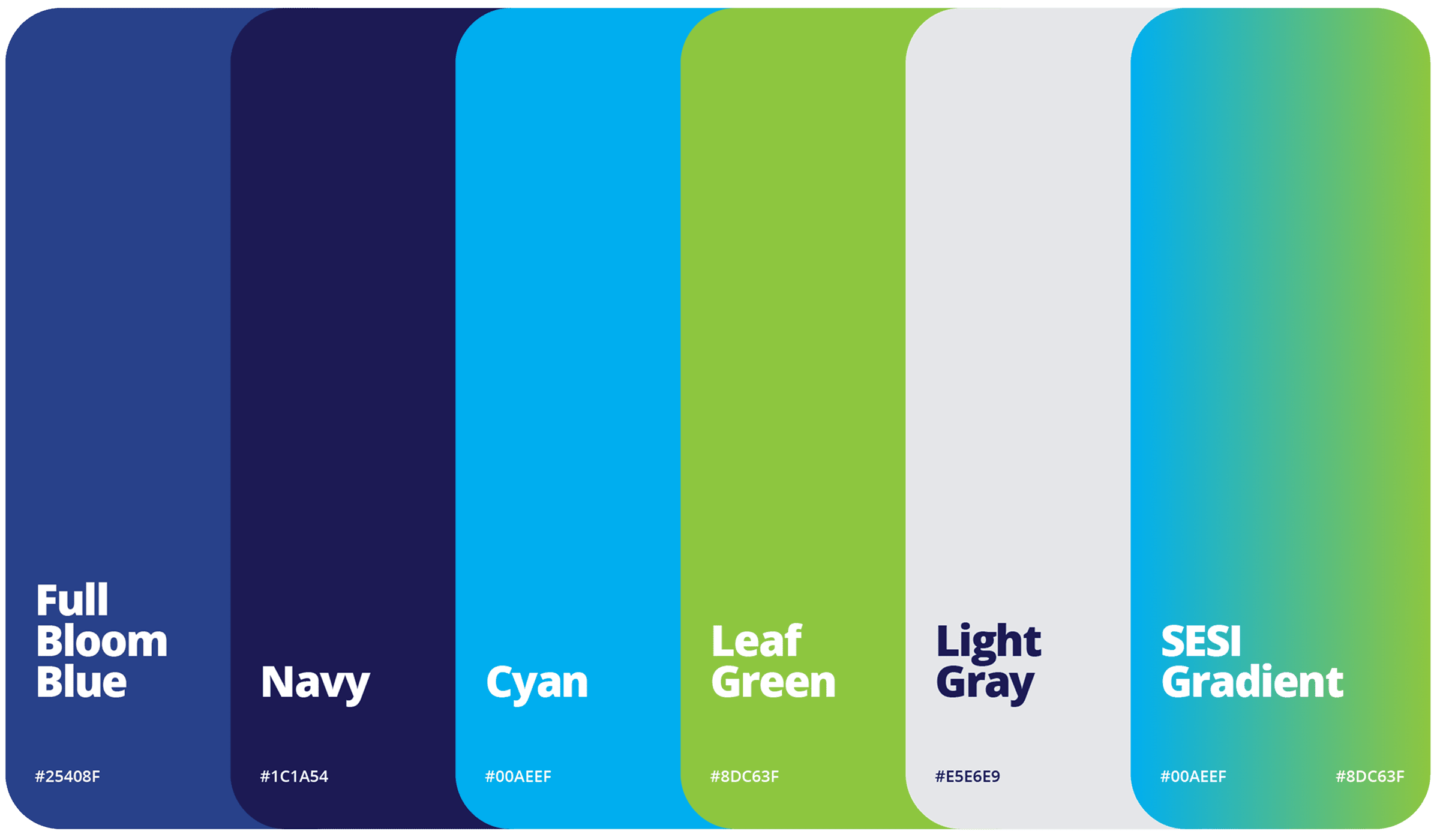
- Color & Gradient Identity: We optimized the use of SESI’s core navy, cyan, green, and gray colors, and introduced a fresh cyan-to-green linear gradient. This dynamic gradient became a signature anchor element, featured alongside SESI’s three-leaf icon, appearing in iconography, signage, print collateral, and digital applications. It injected vibrancy while reinforcing consistency.
- Iconography for Learning Pathways: We created distinctive icons for Bloom, Spring, and Spark, designed as a family to reflect SESI’s structured learning models. Each icon is simple yet powerful, evoking growth, transition, and ignition, themes tied directly to each pathway’s educational philosophy.
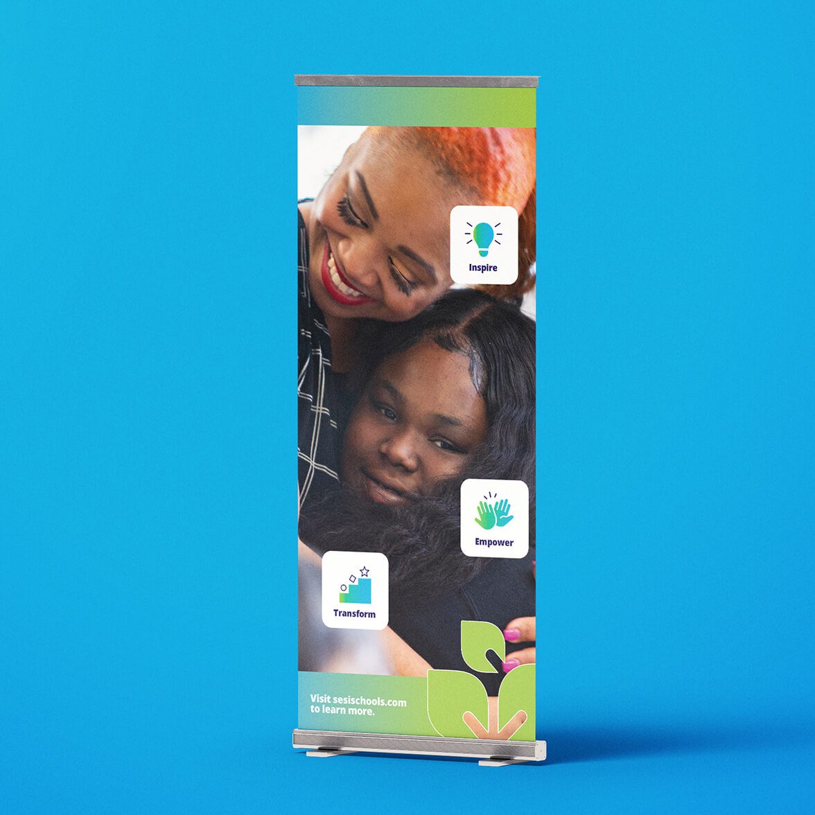
- Messaging Icons for Key Themes: A set of icons for Inspire, Transform, Empower served as visual shorthand for SESI’s mission and were applied across communication materials, anchoring the brand story.
- Print & Collateral Templates: Flyers, posters, hop-up banners, and letterhead were redesigned for clarity and adaptability, ensuring that all SESI schools could present a unified identity across outreach and administrative functions.


calming room
The calming room design features layered wave and hill motifs, created soothing atmospheres to foster focus and well-being. The abstract shapes, reminiscent of hills, waves, and sand, not only sparked curiosity but also reinforced the idea that SESI schools are safe, restorative spaces where students can reset and refocus.


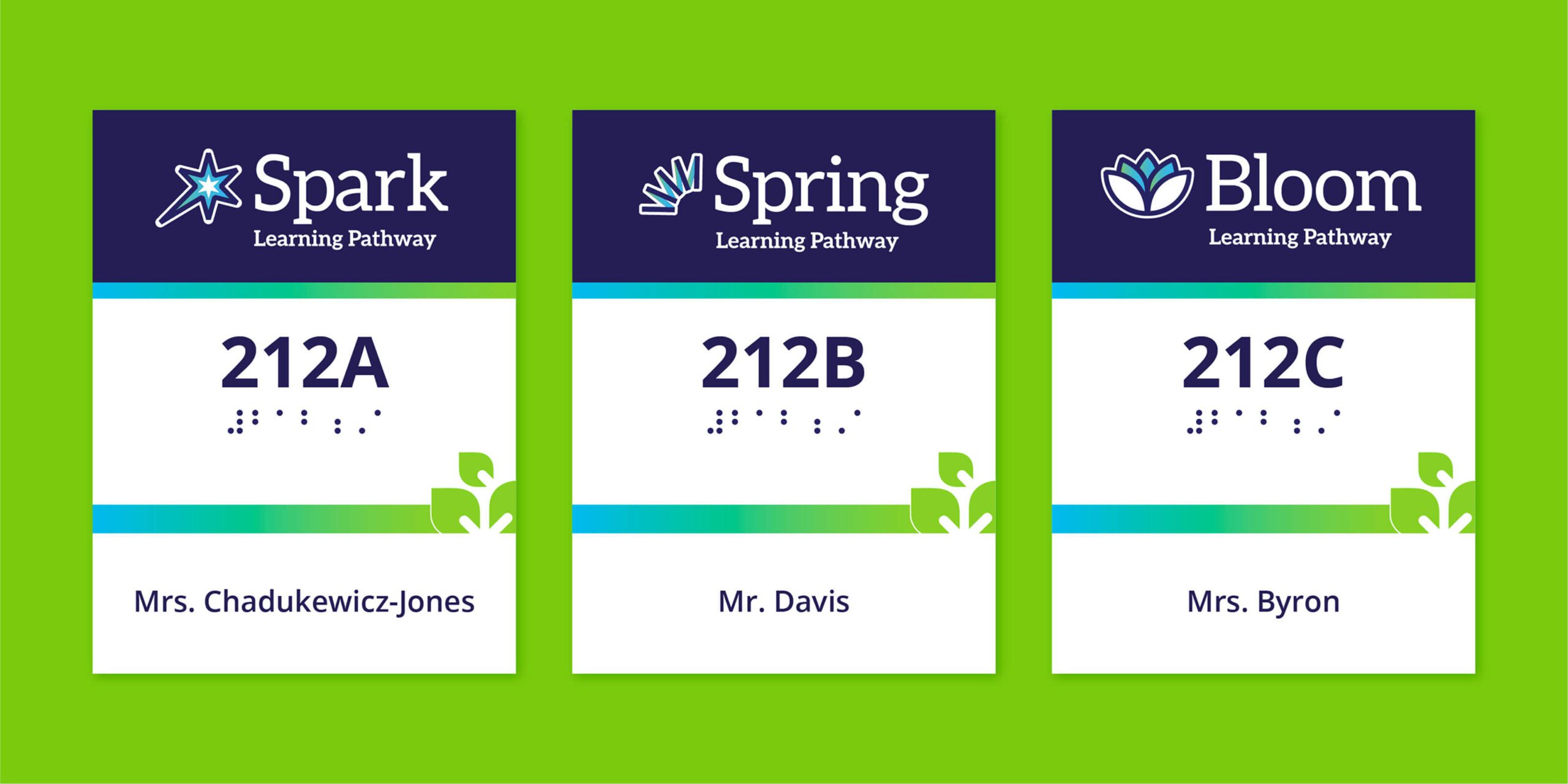
Environmental Signage
From room signs and lobby decals to entrance branding, monument signage, and door mats, we developed scalable signage templates adaptable to different school footprints.
To ensure sustainability, we produced a detailed brand planogram document, including rules for implementing signage, entrance elements, color application, and icon usage. This ensured local administrators had clear guidance to maintain SESI’s unified identity over time.