Project Mockingbird
Bringing Boldness and Intrigue to Life

Project Mockingbird is a premier, full service communications agency dedicated to enhancing causes that are changing the world. Working exclusively with social impact companies and nonprofit organizations, driving awareness and telling client stories is their top priority. Project Mockingbird recognizes how people think and advocate for brands by providing communications strategies, but most importantly, execution and measurable results.
The Ask
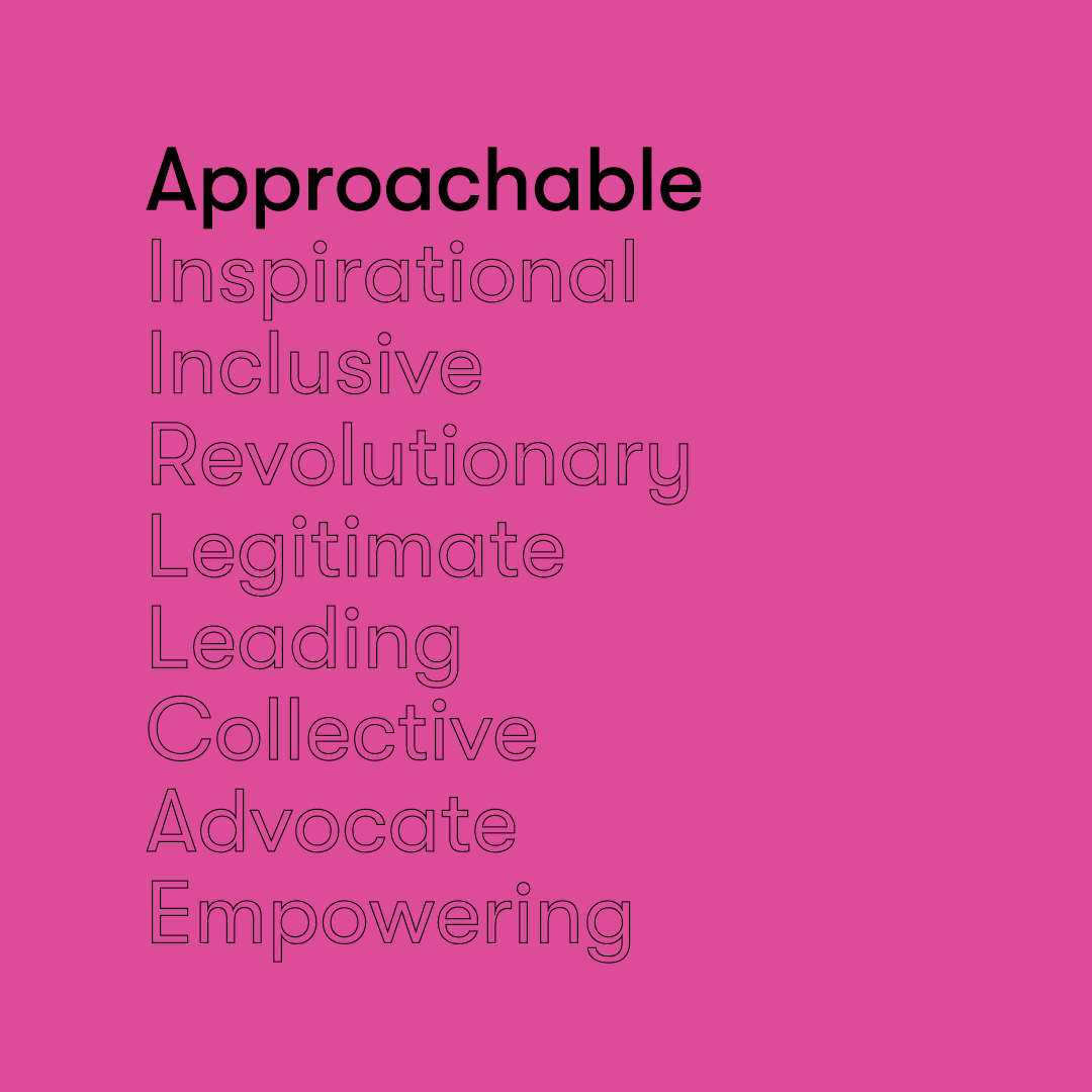
Project Mockingbird needed a fresh, bold and revolutionary brand system. Their company mission is transformational and cutting edge, and wanted their brand story to reflect their visual brand language. The company gets its name from the group activity of mockingbirds when they are together. Collectively, they get louder, louder and LOUDER, building one unified voice to create change in their environment. This is exactly what Project Mockingbird does – they look to harness the power of communications to change our world for the better.
The Solution
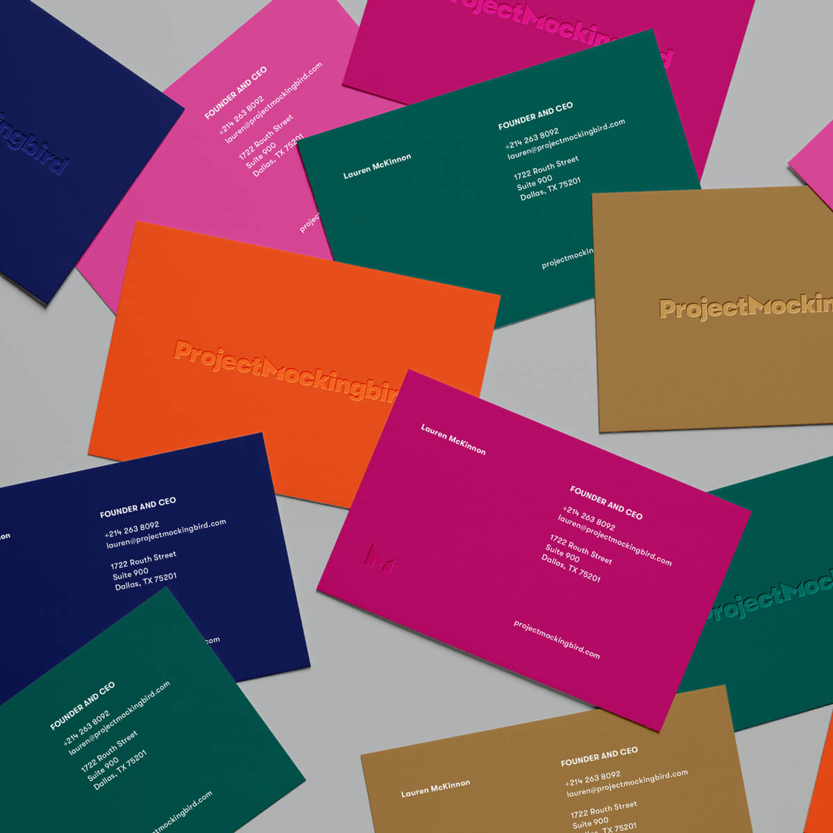
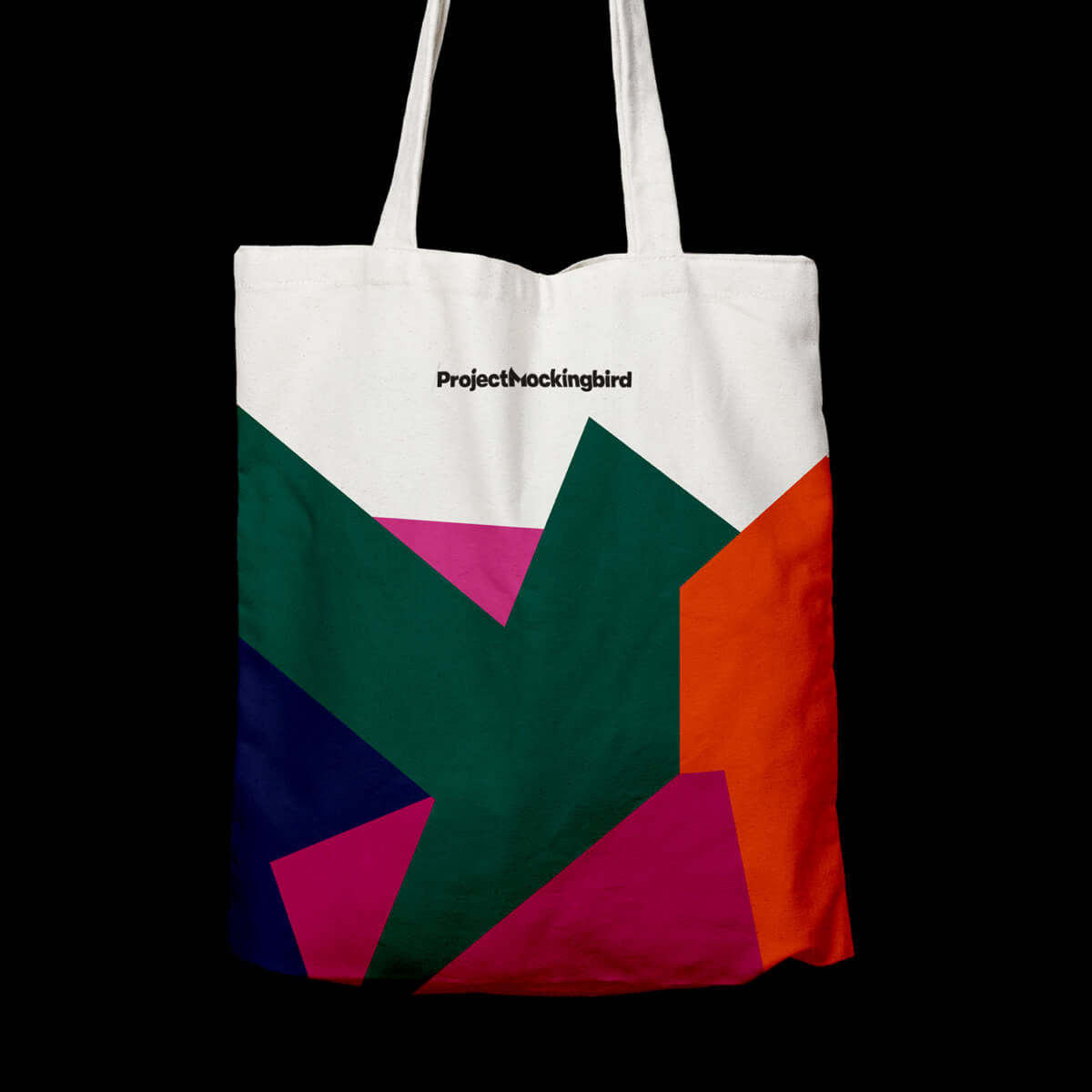
Matchfire built a brand that tied in the company’s values: integrity, grit, family, kindness, courage and prestige. The playful palette combines an intense orange and navy paired with soft pastel purple and magenta that helps balance femininity and masculinity.
The custom brand mark, meant to subliminally represent a mockingbird, is approachable but has a noticeable distinction. The break in the letter M shows the letter pieces merging together to form a strong union relating to how mockingbirds are stronger in numbers. The typeface is friendly but doesn’t skew too feminine or masculine.
The Award
Matchfire is honored to have been awarded for this brand, design and campaign work.
- SILVER for Corporate Brand Identity by the 2021 MUSE Awards.